Quantcast
Channel: ArtSlant
Viewing all 1169 articles
Browse latest View live

"Blues for Smoke": Ambiguity and Duality, Arpeggios and Be-bop Changes

$
0
0

“The blues self is an improvised self. It doesn’t shy away from the difficulty that that entails. When you improvise yourself in culture, you may get some blowback.”[1]

Halfway through the exhibition, a nondescript listening station for John “Jaki” Byard’s 1960 release Blues for Smoke hangs on the wall facing Glenn Ligon’s oil and acrylic text-based reflections and Zoe Leonard’s vintage blue suitcases. When you wander through the exhibition, don’t forget to look for it—you might miss it. If you pause, do take a listen; everything you’ve seen might suddenly become more clear. Jaki Byard was known for his eclectic style as a pianist and composer, incorporating various jazz styles including ragtime, swing, and avant garde into his work, but always maintaining a connection to the blues.

But what is the blues?

Is it a feeling?

An attitude?

Or, as the old saying goes, the stuff that happens between Saturday night and Sunday morning?

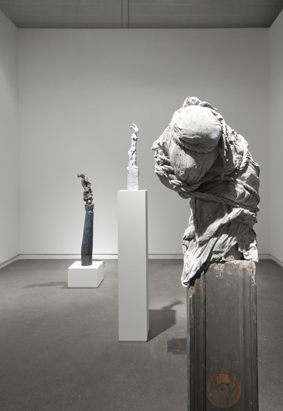
“Blues for Smoke” divulges no easy answers. This multidisciplinary exhibition features a broad range of artists such as David Hammons, Martin Kippenbenger, Mark Morrisroe, William Pope.L, Lorna Simpson, Wu Tsang, and Carrie Mae Weems among others. While many works called to mind Fats Waller’s bouncing stride piano, Art Tatum’s virtuosic arpeggios, Duke Ellington’s suave swing, or a turn of the century New Orleans gutbucket blues band, “Blues for Smoke” asks that viewers be open to a wider interpretation of a blues aesthetic, which can be an exhausting exercise when some pieces seem directly connected to the culture of the blues, but many others do not.

Roy DeCarava’s black-and-white portraits beautifully highlight the public-private paradox of social life. Lady Day and Coltrane’s sultry New York is captured in candid images, while stately row houses, stoops, and children skipping rope on the sidewalks remind us of the quotidian side of Harlem on 117th Street (1951). Romare Bearden’s paint on magazine and newspaper collages delight the senses as allegories for the Great Migration, juxtaposing urban and rural life and the movement of culture from Africa to America and back again. In Jeff Donaldson’s psychedelic color whirl Jampact/JelliTite (for Jamila) (1988), three musicians emerge from the geometric patterns in the background. Rendered in AfriCOBRA’s signature “kook-aid” color palette, the work seems to allude to the group’s belief in a collective working process that spurs each other on like members of a jazz combo trading fours and eights.

The works in the exhibition that demand a suspension of disbelief require that we question what we know, or what we think we know. Melvin Edwards’s welded steel sculptures from the “Lynch Fragments” series might prompt viewers to reconsider how painful memories are remembered collectively. The chain links and torqued bolts of Write When You Can and Fire Blossom (both 1991) hint at trauma, bondage, and the Middle Passage despite their abstracted composition. Dusky pinks and muted browns and grays dominate the canvas in the Jack Whitten painting Black Table Setting (Homage to Duke Ellington) (1974). Whitten, who was greatly influenced by jazz, pulled “developers” like squeegees, rakes, and Afro combs across layers of acrylic paint to visualize the effect of being enveloped by sheets of sound. Ever the subversive, Renee Green created the installation Import/Export Funk Office (1992-93) that critiques the process of constructing knowledge. This library cataloguing hip-hop culture is filled with videos and texts culled from the perspective of a white European outsider trying to define a cultural aesthetic by looking in.

Kerry James Marshall (b. 1955), Souvenir IV, 1998, Synthetic polymer and glitter on paper on canvas with grommets, 107 1/2 × 157 1/2 in. (273.1 × 400.1 cm); Whitney Museum of American Art, New York; purchase with funds from the Painting and Sculpture Committee 98.56.


It might seem odd to spend forty minutes in one place at an art exhibition, but the awkwardness you feel standing at the Blues for Smoke listening station is well worth it. Jaki Byard’s agile, fun, and witty compositions do not apologize for or try to guide us through the dualities and sonic blends we hear. Instead, he seemed to expect that listeners would recognize the fragments of stride, augmented and diminished chords, those be-bop changes, and yes—the blues—when we heard it. “Blues for Smoke” represents a journey through ambiguity and duality, one that tries to convey that a blues aesthetic is more than what can be found in a standard musical progression. The mix of works that alternately refuse and accept clichéd notions of identity sometimes muddle this broader message, and create an unnecessary longing for resolution when resolve should not be needed or expected.


Lee Ann Norman


[1] Bennet Simpson (exhibition curator) quoted in “Review: MOCA’s ‘Blues for Smoke’ captivates and improvises” by Christopher Knight http://articles.latimes.com/2012/oct/29/entertainment/la-et-cm-knight-blues-art-review-20121029


(Image on top: Romare Bearden (1911–1988)Pittsburgh Memory, 1964, Collage of printed papers with graphite on cardboard, 8 1/2 × 11 3/4 in.; Collection of halley k harrisburg and Michael Rosenfeld, New York. Art © Romare Bearden Foundation / Licensed by VAGA, New York, NY.)


Paganism, Pop Culture and Possessive Spirits

$
0
0

Serena Korda's work is a very practical sort of magic: evoking elaborate mythologies and belief systems of days past, while remaining firmly in the here and now through a lo-fi materiality and engagement with site and community. Aping the Beast, her current exhibition at Camden Arts Centre brings together three works themed around animals, animism and the power of ritual.

Dormant in the centre of the main gallery, like a B-movie prop in cold storage, is a fifteen-foot Godzilla-inspired monster puppet of textured latex over bamboo-poles. Three times the creature will be called into action, in performances devised by Korda to accompany the exhibition. The first, The Awakening, has already taken place: schoolchildren dressed as boggarts (mischievous household spirits) in wizened rubber masks performed a slow, considered dance around the beast, which then began to shake and move. A haunting live score by Grumbling Fur conjured a nervous energy that seemed to become both a summoning chant and the roar of the beast itself.

Serena Korda, Aping the Beast, Camden Arts Centre installation shot featuring The Prognosticator;  Photo by Andy Keate.


In the corridor space, a wood-panel television cabinet hosts The Prognosticator, a film of a black cat (selected through an apparently lengthy feline audition process) reclining on a cushion, administered to by its Mod chic owner. Portentous synth music lends drama and significance to the cat's stare, its gaze fixed beyond the camera as though witnessing supernatural visions. A spinning gold pendant features an optical illusion of a pyramid, alluding to the mysteries of Ancient Egypt with its animal-headed gods and reverence of cats in both everyday and spiritual life.

The final film, The Transmitters, depicts five young women in the throes of an uncanny singing, dancing ritual. Grumbling Fur again provides accompanying strings and vocal modulation; the musicians have prosthetic third eyes affixed to their foreheads. The girls move as a swarm, compelled by the increasing intensity of the humming strings and sound distortion to surge together and then apart, their movements a choreographed distillation of the behaviour of teenage fans at rock concerts.

There is something fatalistic in this scene: the musicians are a sinister chorus, a tangle of electrical cords at their white-spatted feet like twisted threads of destiny in a Greek tragedy. They move to circle the girls, microphones held out like Geiger counters, forcing their dance inwards and capturing the clicking of their heels, their rustling clothes, their bland, apathetic cries. Cutaway shots of a tarantula add to the sense of creeping menace.

Echoes of the 1950s recur throughout the exhibition—the dancers' gestures, clothing and hairstyles; the TV cabinet and bright Mod colouring of The Prognosticator; Godzilla itself—perhaps because that age is compressed by popular memory into an era of hidden powers, political machinations, conspiracy and cover up, where the line between fact and fiction wore away under increasing Cold War paranoia, the dawning of the New Age movement and the widespread adoption of television sets into family life. Social change, with its accompanying fears of instability and the unknown, required new means of cultural assimilation: hence the boom of the low-budget science-fiction film, in which less tangible terrors were disguised as monsters for the slaying.

It is this coping mechanism—fakery and allegory as manifestations of a need to bring order and meaning to a chaotic existence—that Korda reconstructs and plays upon. Her performances are origin stories, enactments of things and ideas coming into being, in which snatches and scraps of spiritualism, superstition, cultural codes, folklore and history are grafted together to form new traditions.

Serena Korda, Aping the Beast, Camden Arts Centre installation shot featuring The Transmitters; Photo by Andy Keate.


Myths require repetition to survive and evolve, and Korda integrates elements of rhythm and return on both visual and audial levels. In fact her works are powered by non-verbal feedback loops, whether it be the musician and the fan, the cat and its owner, or the monster and its awakening spirits. Each relationship involves a transfer of energy, in which an object or host is symbolically infused with anima—whether the literal activation of the monster by its puppeteers, or the seeming spirit possession that grips the dancers mesmerised by a siren song. The transmission of movement is thus also the transmission of meaning.

Korda's exhibitions often feel like the tip of an iceberg, their power generated by a giant, submerged body of research. Her performances inspire adventure and exploration—of arcane histories, of materials, of cultural symbolisms. Aping the Beast is a wonderful reminder of the pleasures of an enquiring mind.


Marianne Templeton


(Image on top: Serena Korda, Aping the Beast, Camden Arts Centre installation shot; Courtesy of the Artist and Camden Arts Centre / Photo by Andy Keate.)

A Slap in the Face!

$
0
0

Was it Warhol who said that “art is anything you can get away with”? Maybe. I suppose it doesn’t matter. He probably stole it anyway. As I enter Société on a cold, grey afternoon in Berlin it’s the only sentiment I can think about. Bill Hayden’s current solo show at the gallery smacks of this childish insolence, and yet somehow I am not angry about it. The site-specific installation features oversized black vinyl letters wrapping the words DICKFACE.ME around the corner of a room. Accompanying this wall text is a haphazard sculptural element comprising electrical wiring, lightbulbs, wood blocks, fake fur, bracelets and random kitsch, and a sound component staged with the aid of a small animatronic chicken playing the Muzak version of “Yesterday” by the Beatles with a saxophone. Sounds fun, doesn’t it?

I don’t like to use the word “irreverence” anymore, but it seems all too appropriate here. Hayden appears to be aware of his slapdash approach and the installation is rife with hormonal teenage urges and witty repartee. The font of the vinyl text pieces sets the exhibition’s mood – it’s a whimsical, curvy script that takes the form of the body part it references. (The wall text itself is basically an advertisement for the typeface, aptly called “Dickface” and available for purchase at www.dickface.me). The phallus weaves its way through the rest of the installation as well, appearing again as a lone yellow light bulb dangled amidst a tangle of electrical wire.

Crossing the threshold into the second gallery, I navigate through the suspended structure and my eye catches a paper tag loosely tied to one of the wires with string. The text on the tag mimics the ever-familiar language of safety warning labels on purchased goods. It warns against fire and water hazard and amusingly instructs the buyer to consult a "professional artist" when installing the recently acquired work. Hayden’s humor gets me here, and I find myself meandering through the installation with a more open perspective. Not everything has to be so heavy.

At first glance, the hanging is gaudy and garish and fits nicely into a category I like to call “bro-art”. Hayden takes his considerations to the next level, however. He seems deftly aware of these possible interpretations and—with his tongue planted firmly in his cheek—capitalizes on them to humorous results. The furry mechanical chicken, jauntily perched on one leg and slightly squeaking as it rocks back and forth to the beat, serenades me while I exit the gallery. I grab a free poster on my way out: a graphic, cartoon-like drawing of a grotesque creature with a penis for a nose, standing in a pool of blood while holding a hacksaw. I can’t help but laugh and think that the joke is on me for taking this all too seriously. I can’t help but think that I have been slapped in the face with a… well, you know.


Parker Tilghman


(All images: Bill Hayden, installation view at Société, Berlin, 2013; Courtesy of the artist and Société, Berlin / Photos: Grisha Schmitz.)

The Museum of Everything: An Interview with James Brett

$
0
0

The Museum of Everything’s founder James Brett is perhaps an incongruous addition to the Collector’s Catalogue – since he frowns at the idea of being labeled a collector.

Collector, hoarder, or fanatic – what is so compelling about the Museum’s activity is their novel approach to promoting and presenting artists.

Brett, somewhat of a talismanic leader in this – almost intimidatingly so – has punctured the bubble that is the art world, by representing the underrepresented, but also by circumnavigating the conventions for showing and selling art. 

Their archive is an abundantly impressive one, comprising some 7,000 pieces, which Brett has drawn together and championed, presenting it to audiences through an international series of itinerant exhibitions – the next, Exhibition #5, opens in Moscow, on 26 April.


Charlotte Jansen: How and why did you start collecting?

James Brett: I don't consider myself a collector. Rather I am a part-time accumulator. It is similar to hoarding. It is certainly different to making a decision to form a collection. As to when the accumulating started, probably in childhood.

The Museum of Everything isn't really a collection either. It is an exhibitor and an archive, and most importantly, an informal travelling institution for a specific genre, which floats by and its respective boats.

As you might realise, I have a bit of an issue with the whole notion of collecting. In my own opinion, it is used all too often as some form of high-faluting accolade or achievement to flatter spendthrift gallery customers. The truth is that real collecting is a genetic addiction. If so, then yes, I stand accused.

CJ:You've stated that when The Museum of Everything opened, no-one else was curating this kind of artwork. How did you learn about it and develop your eye?

JB: Not quite. The artists we show at the Museum were exhibited and sometimes in excellent projects. It's just that they were rarely included by curators in contemporary art shows. The reason was simply that self-taught and other non-traditional artists have almost always been considered to be "something else", hence their status as "outsiders".

I personally felt this was wrong. I still do. It smacks of art world segregation – and so my role with The Museum of Everything is to challenge this clearly unjust assumption.

Yet it was the work, not its status, which first got me going. I stumbled upon it and immediately was hooked by its liberated forms and formats. I started to research it, and as I did, found many subcultures with similar themes. The essential truth was that these artists created work without thinking about markets or museums. And as I started to discover more, I realised that they have always existed everywhere, in every country, in every era.

If anyone wants to know more, do what I did and pick up a book on folk or self-taught art, or research the seminal curation of Alfred Barr or Harald Szeeman. Or just look for the many contemporary artists inspired by this kind of material and find out who they dig.

As it happens, in the last year the mainstream art world has finally started to catch up – and hopefully thanks in part to the work of The Museum of Everything. In June we will be collaborating with the Hayward Gallery on a major show of alternative artists; and the theme of the Venice Biennial 2013 is a coincidental mirror of The Museum of Everything – and will surely turn many more onto this essential art form.

CJ: What is your most expensive piece?

JB: Not only is that confidential, it is a misleading question. After all, the price of an object is not its only cost.

For me, the twists and turns leading up to the moment of acquisition are much better indicators of real value. Like the pieces which took days, weeks or years of painful patient negotiation. Or the items which were presumed lost, only to re-emerge unexpectedly many eons later.

CJ:Least expensive?

JB: Also confidential. A wise person reveals neither his bargains nor his fripperies.

That said for years I was addicted to eBay and to the e-services which allow you to snafu an item in the closing seconds of its shelf-life. My home overflows with many tiny jewels which fall into this particular category.

CJ:A favourite piece?

JB: Of course there isn't one. However some years ago I stumbled upon an elaborate cork castle in the closing moments of an antiques fair. It wasn't costly and was perhaps even lying about its age. Yet it was so enormous and over-ambitious in its design, with such intricate brickwork and ornamentation, that we decided to display it in all our overseas shows as an original model of The Museum of Everything in London.

CJ: If you do not like the artist as a person, do you still buy the work?

JB: Creativity is not about being liked, nor is great art. Some of the worst art crimes are committed for a toothy smile.

CJ: Do you ever feel territorial about pieces or artists?

JB: You cannot and should not try to control an artist or their work. The best you can do is support them and it. If the artist is living, make their work known. If the artist is dead, celebrate their work and communicate its truth. There are way too many examples of collectors who in not wanting to miss any of their artist's masterpieces hoarded them all, and in so doing, denied the artist visibility. This kind of territorialism does few artists any favours.

The only difference might be where I do not believe an artist or idea is being communicated correctly. Perhaps the strongest example was when The Museum of Everything presented over 500 artworks in Exhibition #4 made in studios for artists with learning disabilities. Not only did we have to communicate that yes, this was art and yes, these people were artists, but also that a mighty department store in London can be a museum.

We fought a lot of bigotry against the artists – as well as bigotry against the store itself, which supported the project in a way no formal institution could have done. The result was a revolutionary project with 100,000 visitors and a real democratisation of the viewing process. And I still feel completely territorial about the whole thing!

CJ: What would be in your dream collection?

JB:For many years I have tried to build a dream collection. But I usually wake up too late to write them down. 

www.musevery.com


Charlotte Jansen


(All Images: Courtesy of the Museum of Everything.)


Photoworks, 1969 - 2011

$
0
0

Formerly exhibited at the Louise and Reuben Cohen Art Gallery of the Université de Moncton, Garry Neill Kennedy’s “Photoworks, 1969-2011” avows the artist’s politics while broadly questioning the nature of the photographic medium. Kennedy is one of Canada’s national treasures, not only as an artist known primarily as a conceptualist painter, but also as an arts educator with his role as president of the Nova Scotia College of Art and Design (NSCAD) from 1967-1990. Chronicled in his recent MIT press publication, The Last Art College: Nova Scotia College of Art and Design, 1968-1978, Kennedy historicizes an impressive intuitive roster of visiting artists including Mel Bochner, Daniel Buren, Lucy Lippard and Martha Rosler, among others. The book celebrates a decade of innovative projects and interactions between students and faculty that brought the institution nearly mythical recognition.

I was pleased to chat with the artist at the opening as he elaborated on a number of artworks while generously inquiring after my own background and interests. While we ruminated on the nature of institutional critique—before it was part of the art vernacular—I noted a genuine accessibility without didacticism under his fierce eyebrows and intellect, a quality that also resonates throughout the exhibition. “Photoworks, 1969-2011” utilizes both analog and digital technologies with images culled from various source materials, from film stills to amateur plane spotters. Grids are primarily used to display the photos but Kennedy playfully backgrounds his arrangements with painted frames, a nod to his conceptual roots. Printed matter has also been a strong component of Kennedy’s practice and several corresponding artist books are available on a table in the gallery near their photoworks offering another representation of the work. Some document as in Recent Plants (1980); another operates as a work in itself, Special Presentation (1982); and others contain accompanying essays or text as with Moving Stills (1991).


The artwork, Recent Plants presents a selection of potted plants captured on Polaroid, here affixed on a painted strip of ochre and moss hues. The plants were photographed in situ from art galleries around Toronto. At PLATFORM, as in the first installation at Mercer Union Gallery, actual plants inhabit the space near their image counterpart (although originally some of the plants were the same plants as in the photographs). As previously mentioned, a nearby table presents Recent Plants as an artist book that documents the fifteen Polaroids. This collision of representation offers a more thorough context to Recent Plants while simultaneously complicating its subject as “recent”. As with many of Kennedy’s artworks the rules of engagement are laid out but the play is up to the viewer.

On opposing walls, Moving Stills and Spotted (2009) reflect histories of violence through both plain and hidden sight. Moving Stills consists of forty-two red tinted film stills framed by a dark blue background that depict moments primarily from westerns. The images are largely of the Hollywood “Cowboys and Indians” genre and show climactic scenes of conflict. The effect is one of reductive binaries exposed through exaggerated gesture. Spotted is a grid of twenty-five dark blue tinted prints of airplanes grounded and in flight pulled from thousands of online postings by amateur plane spotters. Kennedy has accessed these image databases of plane spotting enthusiasts and noted CIA “rendition planes” from aircraft identification numbers cataloged by human rights groups. Here Kennedy has chosen to frame the work in orange, further prompting associations with Homeland Security and its color-coded risk alerts.


“Photoworks” also included a performance component. For My Fourth Grade Class Picture (1970), Kennedy digitally reproduced and enlarged a black-and-white photograph of himself and his young classmates. During his performance at PLATFORM he wrote the names he could still remember on the front of the photograph, inverting the practice of individuals signing names and comments on the back for future reference. In this, as in many other artworks in the exhibition, Kennedy queries common assumptions associated with the medium of photography from its role in documentation to an arbiter of truth. 


Courtney R. Thompson


(All images: Garry Neill Kennedy, Installation views; Courtesy PLATFORM centre for photographic + digital arts.)

INTERVIEW from Sixty Inches from Center: Visual Theater: A Conversation with Neo-Futurist Kurt Chiang

$
0
0

The Neo-Futurists are a staple of Chicago theater best known for their modular and ever-evolving signature show, Too Much Light Makes The Baby Go Blind, which, after a quarter-century in production, is the longest continuously running show in Chicago. Within a certain milieu, TMLMTBGB is something of a cult hit — It’s frenetic, inclusive, somewhat participatory, absolutely community oriented and just plain fun.

Perhaps less well known are the limited-run productions the Neo-Futurists stage each season. I recently had the chance to catch their new play, Analog. The production is far quieter than TMLMTBGB, but no less intimate; both share the trademark “non-illusory” first-person writing for which the ensemble is known. The play, conceived by Kurt Chiang, attempts to stage the auteur’s inner monologue as he comes to grip with both a life-threatening bout of cancer and his baffling, idiosyncratic manner of coping with the event — transcribing, by hand, the entirety of Lord of the Flies, a laborious task born of gauzy motivations.(In Analog, Chiang himself refers to William Golding’s classic novel as “not a very good book.”)

Given this publication’s focus on visual art, Analog may seem like an unlikely subject. Originally, I had no intent to cover the show here. That changed shortly after arriving at the theater. Rather than being allowed in the front, several other attendees and I were lead around the back of the building and into the alley. (This experience was immediately bewildering, no doubt on purpose, though the staff received serendipitous help from two black cats that dashed across the alley in tandem, giving us all a start.) Upon entering the back door, patrons were handed programs by disaffected ushers, many of whom are also performers, slouching in chairs, seemingly too engrossed, or at least pretending to be engrossed, in various novels.

Kurt Chiang, An early sketch of the installation, 2013; Courtesy of Kurt Chiang


We were then given free range to wander through a labyrinth fashioned from draped white cloths. Reading stations were set up where attendees could thumb through copies of various books, including, most notably and thematically, Lord of the Flies. Overhead lighting was kept to a minimum, our path partially lit by the light from a projected video and vintage lamps at the reading stations. Recorded speech played simultaneously from different sources, the tracks clashing and crashing into each other. The whole thing was jarring and affecting. Something of a walk-in art installation, it merges visual art with sound, multimedia and, ultimately, theater.

I recently talked with Chiang about both the installation and the production...


Read more on Sixty Inches from Center...

(Image at top: Credit Michael Sullivan, courtesy Sixty Inches from Center.)

Cover Song

$
0
0

I want all of Sam Gilliam's paintings in this show to be book covers.

Perhaps it's because their flatness and angles look so much like package designing of a certain era. I've always felt similarly about Ellsworth Kelly, whose bright, cheerful paintings look like they'd been stolen from the detergent aisle and had their explosively optimistic names removed. Gilliam’s paintings on view at David Kordansky look mostly to me like one of the more recent cover designs for JD Salinger's Catcher in the Rye, which is white with simple text and a streak of rainbow angled diagionally across the top left corner. According to legend (i.e. a poorly sourced claim on the internet), Salinger made a contract rider diktat that none of his subsequent book covers could have cover images after one sales-savvy cover designer transformed a seven-year-old girl to a blowsy, busty blonde cover girl. That rule made Salinger covers a favorite for nostalgic graphic designers, though they tend to hate my favorite, the white/rainbow cover.

My cover got grimed and thumbprinted, tossed around and reread so that the crisp cut of the pages rounded with dirt and wear. This is my preferred treatment for slick modernist purity. Every time I see a John McCracken sculpture, a plank of pure shiny color leaning against the wall, I want to smear a greasy finger down all that gleam. Purity of that kind was always a tool of power. Sometimes power is fun, but coming from the underclass, fucking it up is even funner. I think the generic nature of the Salinger cover appealed to me, its simplicity a statement of its own. In my 80s-youth onslaughted by conspicuous consumption and garish graphics, simplicity and austerity became a revolutionary act. Making it dirty made it mine.

Despite some exceptionally breathy advertorial in the press release, these paintings are not all that 'revolutionary' as paintings. They came well-after Morris Louis and Kenneth Noland, the first-string of what would later become known as the Washington Color School, who did the same thing earlier. These paintings are some might say that dirty d-word, derivative, but that doesn't mean you have to hate them. Gilliam is best known for the paintings that came at the tail of this body of work, these big drapey paintings tie-dyed with color and hanging loosely off the wall, often made with some site specificity in mind (or so I'm told). Those drapey painting, though I've only seen them online, do look revolutionary. Bright and mournful, their movement appears to unite in their somber way the action and abstraction that made Pollock a giant but without the predecessor's tense freneticism. While Robert Morris's drapey materials had their own sex appeal, his was always S&M industrial. Gilliam's drapey paintings of the late 60s have a softness of color and form that puts the two artists side-by-side, but gives Gilliam a lyrical advantage. I've only ever seen pictures, so a lot of this is guesswork, but they look smashing and fresh forty years later.

Sam Gilliam, Helles, 1965, acrylic on canvas, framed: 73 1/4 x 72 3/4 x 2 1/4 inches; Courtesy of the Artist and David Kordansky Gallery.


But being really and truly original isn't always as important as marketeers and others would want it to be. I've wept to cover bands playing bang out heartbreaker versions of tread-worn pop songs to small beer-stained audiences in eastside dives. Playing the standards wasn't always a pure, nasty dig. These paintings are still pretty darn good. They have all the energy of a racing stripe and all the pacifying softness of a Prozac ad. They are as American as Jackson Pollock and apple pie and a brand-new Chevy rolling right off the line in the Eisenhower years. They are each and all a basic design, filled with cool unpretentious energy. And though as an authored gesture, they may not cut the mustard as revolutionary, but as a gesture, especially one that led to others, their simplicity is certainly so.


Andrew Berardini


[Image on top: Sam Gilliam, Theme of Five I, 1965, acrylic on canvas, 70 x 83 inches (177.8 x 210.8 cm); Courtesy of the Artist and David Kordansky Gallery.]

Don't Let 'em See You Sweat: Notes on Work

$
0
0

In the mind’s eye hangs a poster of a discomfitingly adorable orange-and-white kitten clinging perilously to a tree branch by a single paw. In thick bubbly script are the words "Hang in there, baby!”

I don’t know much about what my friends have accomplished this year, but we are all exceedingly familiar with what we’re in the middle of doing, and more obliquely, what we intend to do.

We know exactly how hard we’re working. 

***

Eight undergraduate students nurse Monday morning coffees, shuffle papers, idly click pens; gray faced, eyes bloodshot and bagged.

“How’s everyone doing today? Are we okay?” the professor asks.

Seven voices mumble some assent. One student sighs more audibly, more deliberately, and in a manner more solicitous of inquiry than the rest.

“What’s up with you?” the teacher asks.

“Oh, me?” the student replies, “Nothing, I’m just really tired and I have a thing due tomorrow.”

“You’re tired and you have a thing due tomorrow? Everyone is tired and has a thing due tomorrow. What makes you so special?”

***

Charles Sheeler’s Aerial Gyrations is a little oil painting from 1953 in the permanent collection of SFMOMA, not currently on view in the museum but hanging around nonetheless. It is sized to disappear even when on display. I first saw it tucked into a corner of some show of the permanent collection, a backstock of greatest hits sagging under a long and mellifluous title that invariably included the word “selections.” Passersby noticed me staring at the painting before they noticed the painting itself.

Aerial Gyrations was composed by overlapping negatives from photographs Sheeler took of the U.S. Steel Plant in Pittsburgh, which he reversed, superimposed, and rearranged to satisfaction before copying them on canvas in flat, un-layered, candy-hued colors—licorice blacks edge up against soft caramels and gumdrop blues in near-perfect alignment (in engineering the term is “aircraft tolerance”). The fallibility of the artist’s hand is only caught in careful examination: the slightest wiggle of line here, a smidge of overlap there. Overall, the picture conveys ease, lightness, efficiency; the complexity of the process made evident only by the accompanying wall label, which also reads:

“I favor the picture which arrives at its destination without the evidence of a trying journey rather than the one which shows the marks of battle. An efficient army buries its dead.”

I think about the painting when I am tempted to fish for a few premature pats, to advertise yet again my progress on unfinished projects.

***

I’ve made the mistake, time and time again, of following writers I admire on one or more social media outlets—usually Twitter—only to be disenchanted by what turns out to be a steady stream of neurotic logorrhea; sentences spent wringing hands over a sentence, wounded mewings about reviews, rejected pitches cathartically sent out into the ether. Anxiety over a writing practice almost entirely devoted to the anxieties of writing is not a life most starry-eyed go-hards imagine after discovering they can turn a phrase. It feels like an emotional feedback loop.

***

I finished Virginia Woolf’s A Room of One’s Own during a lunch break at an old retail job, during a protracted stay at community college. By then I was already settled into the habit of blaming my lot in life to the penury of my oeuvre, resenting the work that paid (most of) the bills, kept me roofed and shod, leaving a sliver of time to write had I not filled even that with brooding. I pretended to empathize with the parable of Shakespeare’s sister, feeling absolved of any responsibility to work for myself, because my checks were bouncing and I shared a bedroom. “But,” Woolf ends her book with a crucial caveat, “I maintain that she would come if we worked for her, and that so to work, even in poverty and obscurity, is worth while.”

***

Clinically depressed, a narrow avoider of multiple suicide attempts, Dorothy Parker had trouble getting to work. “I hate writing, I love having written.” Though she never made it through a novel, she did make it to age seventy-three, dying of natural causes.

***

What’s left to do after that, but promise to show up? To do my best? To bury my dead?


Christina Catherine Martinez 


[Image on top: Charles Sheeler, Aerial Gyrations, 23 5/8 in. x 18 5/8 in. (60.01 cm x 47.31 cm), Acquired 1974 / Collection SFMOMA / Mrs. Manfred Bransten Special Fund purchase; © Estate of Charles Sheeler 74.78.]


Ode by a star-struck aficionada

$
0
0

Wandering through the colorfully gay labyrinths of 798 – by far, the foremost art district in Beijing – on a chilly January afternoon, I stumble onto a grey building, quite out of sync with its neighboring galleries and museums that shine in colourful resplendence. This, however, is it– my pilgrim spot – the Faurschou Foundation, Beijing. Inside its grim and non-glamorous exterior, it is housing an exhibition of Louise Bourgeois’s works – for the first time in China, curated by the artist’s long-time partner Jerry Gorovoy. Stepping inside the premises to witness Bourgeois’s art from up close and so personal was thus nothing short of the experience of entering a temple for me. It was the moment of self-gratification. This piece is therefore not – and cannot be – a review, in the strictest sense. It may at best be read as an ode by a star-struck aficionada.

There it was – in the very first room – the giant Crouching Spider (2003) made out of steel. It literally took my breath away as I stood gazing at its enormity and the intricacies of its details, which could have come only from somebody who deeply empathised with the otherwise-insignificant creature, and found reflections of her ‘mamman’– mother – in it, by virtue of its industriousness, tolerance, patience and protective nature.

Louise Bourgeois, THE COUPLE, 2003; Photo by Jonathan Leijonhufvud, + Louise Bourgeois Trust/ Licensed by VAGA, NY#5385.


I really had to see it to believe it, to feel the tactility in her sculptures. I was left speechless thereafter, as I stared at the suspended aluminum Couple (2003). The malleable fluidity achieved out of sheer concrete could have been the handiwork of someone who had poured out the entirety of her very existence – complete with its pain, trauma and distress – into the making of this exquisitely moving work of art. Shapes and sizes conforming to social dictates become redundant, as the two bodies that entwine to form the couple contort and distort individually and together to form a third enmeshed identity that is more spiritual than physical. It is, as Gorovoy writes, one of the many visual articulations of Bourgeois’s sense of intense loneliness, insecurity and the consequent need for desperate clinging on to all that she held dear to her; the fear of loss dripping from every ounce of her creations. For her thus “hell” was not Sartre’s “others”: it was in fact, the very “absence of others.”

Years of childhood trauma stemming from multiple sources, most of which remain unknown – thereby bringing in that aura of enigma in her works – reveal themselves most poignantly in her depictions of the female body (Nature Study [1984], Pregnant Woman [2003], In and Out [1995]). Even though her chosen colour to depict femininity remains pink or red, her mediums vacillate between hard as marble and soft as cloth; and they enthrall not only in the details of their tininess, but more deeply, in their primal quality – that frees them from the confines of just the human soul, fusing a oneness with the larger living world.

Louise Bourgeois, NATURE STUDY, 1984, cast 2000; Photo by Jonathan Leijonhufvud, + Louise Bourgeois Trust/Licensed by VAGA, NY#750D.


A life as complex and rigged with turbulence as Bourgeois’s could have frittered itself away and passed into oblivion like that of so many others. We are a lucky lot, a blessed lot, who can witness the outcome of such unabated trauma as it flowered into the most potent visual articulations; filling us – distanced from her in time, space and culture – with an empathy that can perhaps emanate only from art, that has sometimes been used as catharsis, sometimes as language and mostly as palliative – if not cure.


Paroma Maiti 


(Image on top: Louise Bourgeois, CROUCHING SPIDER , 2003;  Photo by Jonathan Leijonhufvud + Louise Bourgeois Trust/ Licensed by VAGA, NY#5385.)

Describing Labor

$
0
0

On a wall in the showroom for Describing Labor there is a series of glass hammers and gloves. The pieces were designed by Esther Shalev-Gerz and produced by artisans at the Glass Pavilion in the Toledo Museum of Art. They are a symbolic gesture, reflecting the tools of labor, but incapable of functioning in a utilitarian manner. The gloves cannot be worn and the hammers would shatter if pounded even slightly.

The crux of the exhibition is a series of twenty-four collaborative large-scale photographs taken by Shalev-Gerz. The contents of each image were arranged by the invited participants, who are all local members of the creative milieu of Miami, some from the Wolfsonian itself, and others from fields as disparate as poetry and hair styling. The effect is stunning, and walking in the gallery reveals an artfully arranged splendor of artifacts, a sort of archival ikebana.

These artifacts come from the Wolfsonian’s collection, which houses a variety of objects and ephemera from 1851-1945. It is a vast collection, consisting of over 150,000 pieces, some of which depict men and women ensconced in the various drudgeries of production, whether for the glory of the people and their discovery of interchangeable parts, or mobilization for war. Through these objects, labor becomes the recurring visual reference in the photographic series.

Esther Shalev-Gerz, "Describing Labor - USSR in Construction and Photograph (untitled)", 2012, Installation shot; Courtesy the Wolfsonian Institute.


The participants were called upon to choose one object from forty-one representations of labor. The depictions spanned a variety of mediums from illustration to photography, oil painting and sculpture. Participants were then asked to describe the selected piece, whilst staring at it. This exercise was filmed and the video played in a continuous loop in the exhibition hall. Afterwards, Shalev-Gerz's collaborators were brought two floors down to the large object storage room where they placed their chosen piece amongst other items from the collection.

Shalev-Gerz did not move the objects; she simply photographed them. Sometimes striking, and sometimes beautiful in their banality, they stand representative of each participant’s decisions. And through their verbal explanations the pieces themselves become a conduit for description.

What is interesting to consider is that actual work must be done for full appreciation of Describing Labor. Confusion for the uninitiated lies in experiencing the show without the patience to delve deeper. It helps to move through the process of one of the photographs to truly grasp what Shalev-Gerz is striving for.

Describing Labor – USSR in Construction and Photograph (untitled), 2012, is one of the few instances in which two pictures were chosen by the collaborator. In this case it was Ruth Sackner, a famous collector of concrete and visual poetry, who explains that she chose the photo on the left when she noticed it showed a woman doing heavy industrial work typically reserved for men. Sackner goes on to say that women doing war work is “timeless and still meaningful to us today.” She tells the camera that one of the women in the opposite picture, taken from a Soviet periodical, reminds her of her paternal grandmother. This admission makes the experience hugely personal.

What is most fascinating about the process is that all of the participants, without specific prompting, offer up reasons for their selections. This highlights a general pattern in which people relate to the artifacts of labor, and to artifacts in general. Consequentially, the main focal point of Describing Labor becomes the act of description rather than labor or the objects that depict it. These elements, the photographs and their explanations, make each piece in Describing Labor a cohesive whole.


Nathaniel Sandler

(Image on top: Esther Shalev-Gerz, "Describing Labor - Man with Drill", 2012, Installation shot; Courtesy Wolfsonian Institute.)

There's a Snake in the Cobra Museum

$
0
0

Honestly, I've never been a big fan of Cobra and their brand of playful semi-figuration, although that is primarily due to me not really being a painting guy (to stay within the movement, I'd take one of Robert Jacobsen's primitivism-infused industrial artifacts over a Karel Appel painting any day). As geographically de-centered as the group of artists involved was (Copenhagen-Brussels-Amsterdam, hence the name), their legacy lives on in Amstelveen's Cobra Museum. And, it turns out, the movement’s spirit echoes in contemporary art today in ways that resonate with me more than the original corpus does.

Visiting the Michael Tedja solo show at the Amstelveen venue makes the connection apparent: although the Surinamese-Dutch artist is evidently more inspired by Jean-Michel Basquiat's urban energy, and he embeds his own work into a more rigorous conceptual matrix, and a creative urge similar to the one animating Cobra art can be sensed throughout.

Michael Tedja, Sssssssssnake, 2011; © Michael Tedja, courtesy Galerie Nouvelles Images, Den Haag / Photo: Hennie van Beek.


The difference is Tedja's pieces feel way more urgent. On one hand the artist indulges in a wider and more eclectic use of media, appropriating with Rauschenbergian voracity tridimensional objects in his compositions (the term “painting” doesn't really apply here). Wood planks, bike tires, thread, even small (and less small) sculptures. Some of the latter depict black Santas, a theme that resonates strongly within Dutch culture and connects to a prominent topic in Tedja's art: race. For those who've never spent time in the Netherlands in early December, a little premise is due: the Dutch don't have Santa Claus, but Sinterklaas, a bishop-like horseman en route from Spain with an entourage of black “friends” (curly hair, big lips, earrings and all) on his trail. These “helpers” (who are black because revised 21st century narratives claim they fell into a chimney, of course) are called “Zwarte Piet” (“Black Pete”), and they are way more popular with kids than their bearded, red-clad counterpart. Needless to say, the issue is controversial, and Tedja – Rotterdam-born, but grounded in a colonial past by his Surinamese origins – doesn't shy away from it. This is just one example though: the word “zwart” is literally stamped across many of the collages on show, arranged into letters or drawn from newspaper articles. The color black is also used as a backdrop to iconic Dutch elements: a white-painted “omafiets” (grandma bike) is plastered against a pitch-black canvas; a black bike tire is inscribed inside of a bigger white one on an orange background, marked by a diagonal cross.

Tedja also reflects on another environment that strongly affects him: the art world. A few profiles of prominent black figures in contemporary art circles – like curators Thelma Golden and Franklin Sirmans – are arranged below some of the artist's compositions, which stand like portraits or tributes to their practice. As for the artist himself, his own face is printed as a black and white icon and collaged over and over again – for example as both ends of a Double Headed Snake, a figure appearing right next to a big banner stating “I love capitalism” by the exhibition hall's entrance. The snake is then a sort of allegorical alter-ego of Tedja himself, a dangerous animal that slides freely around the gallery space.

Michael Tedja, installation view of Snake, Cobra Museum for modern art, Amstelveen, 2013; Courtesy of the artist and Cobra Museum, Amstelveen / Photo: Gert Jan van Rooij.


Aesthetically, the exhibition is a rich experience. The artist moves from small-sized collages (nonetheless organized in monumental grids) to wall-wide compositions that encompass both instinctive painting and painstakingly woven thread compositions, which layer up on them. A poem titled Elitist by Definition (2011) accompanies the visitor throughout. If it weren't for the works’ visual and thematic cohesion, the space might have felt cluttered, but the display is mostly in line with Tedja's own approach, balancing anarchistic mesh-ups with the white cube framing them. Regardless of its relationship with Cobra, the show is worth the visit.


Nicola Bozzi


(Image: Michael Tedja, installation view of Snake, Cobra Museum for modern art, Amstelveen, 2013; Courtesy of the artist and Cobra Museum, Amstelveen / Photo: Gert Jan van Rooij.)

Smuggling Kif

$
0
0

When James Edson, owner of Mowlem Street’s Wayward Gallery, was first told about Seba Kurtis’ new book, Kif, little deliberation was needed upon deciding whether or not to show Kurtis’ collection of illuminating photographic work. After reading less than a paragraph from the accompanying book, James became entirely convinced by the heartfelt tale of two migrant friends caught up in the gruelling business of smuggling drugs.

Kif, in what is the Wayward gallery’s first show of 2013, presents a story through the lens of an unlikely perspective in hindsight and experience, in homage and reflection, depicting the various hidden realities of those living on the borderlines, and getting by with whatever few means possible. Born in Argentina during the seventies, Seba Kurtis fled Buenos Aires in 2001 amidst a tumultuous backdrop of nationwide political crisis under the rule of Augusto Pinochet. Taking his family to Tenerife, Kurtis had no option but to remain on the edges of society, finding himself being thrown into the burgeoning dangers of illegal immigration and poverty. It was around this point in his life where he met Dodo, the story’s lead protagonist and unfortunate link into the underworld.

Seba Kurtis, Mirrors; Courtesy of the artist and The Wayward Gallery.


The reason Kif feels as though it could be a read out like a fictionalised account of inspired friendship and loss, is purely down to the arrangement of diverging elements. Firstly, and most importantly, Seba’s imagery recounts a forgotten, yet beautiful landscape that is cohabited by the unforgiving nature of exploit and corruption, one where Dodo’s life seemingly flourished and sadly, was taken. In reflection to the death of his dear friend, Kurtis’ work nods towards stark contrasts evident between the hashish (or natively ‘Kif’) smuggling trade and its stunning, rural location. Pictures that include whitewashed medinas clinging to slopes on the Rif Mountains appear hazy and somewhat calm, giving a sleepy sense of what should be a peaceful environment. While on the other side of the room, stern portraits of local individuals, and x-ray scans of bodies that act as holding bays to cartel contraband cargo, reminds us of a graphic, non-fictional reality, that many similar to Dodo have unfortunately succumbed to.

Akin to documentary style, much of Seba Kurtis’ work mixes fantasy and reality, as he traces the steps from where Dodo was found dead in Barcelona, all the way to a small Moroccan province, Chefchaouen, where the illegal trade was cultivated and applied. Looking around the room, you’ll notice that there are no contextual descriptions given to any of the images, nor is there an introductory statement for the exhibition explaining Kurtis’ background. This purposely lends itself to swaying a primary importance towards the journal’s account, and on the whole forces the issue of one using Kurtis’ personal story to engage further with the exhibition's telling imagery.

The photographs from Kif will be exhibited at The Wayward Gallery, 47 Mowlem Street, London E2 9HE, from Friday 5 until Sunday 14 April.


Fred Paddington


(Image on top: Seba Kurtis,Tetouan; Courtesy of the artist and The Wayward Gallery.)

Don't Let 'em See You Sweat: Notes on Work

$
0
0

In the mind’s eye hangs a poster of a discomfitingly adorable orange-and-white kitten clinging perilously to a tree branch by a single paw. In thick bubbly script are the words "Hang in there, baby!”

I don’t know much about what my friends have accomplished this year, but we are all exceedingly familiar with what we’re in the middle of doing, and more obliquely, what we intend to do.

We know exactly how hard we’re working.

***

Eight undergraduate students nurse Monday morning coffees, shuffle papers, idly click pens; gray faced, eyes bloodshot and bagged.

“How’s everyone doing today? Are we okay?” the professor asks.

Seven voices mumble some assent. One student sighs more audibly, more deliberately, and in a manner more solicitous of inquiry than the rest.

“What’s up with you?” the teacher asks.

“Oh, me?” the student replies, “Nothing, I’m just really tired and I have a thing due tomorrow.”

“You’re tired and you have a thing due tomorrow? Everyone is tired and has a thing due tomorrow. What makes you so special?”

***

Charles Sheeler’s Aerial Gyrations is a little oil painting from 1953 in the permanent collection of SFMOMA, not currently on view in the museum but hanging around nonetheless. It is sized to disappear even when on display. I first saw it tucked into a corner of some show of the permanent collection, a backstock of greatest hits sagging under a long and mellifluous title that invariably included the word “selections.” Passersby noticed me staring at the painting before they noticed the painting itself.

Aerial Gyrations was composed by overlapping negatives from photographs Sheeler took of the U.S. Steel Plant in Pittsburgh, which he reversed, superimposed, and rearranged to satisfaction before copying them on canvas in flat, un-layered, candy-hued colors—licorice blacks edge up against soft caramels and gumdrop blues in near-perfect alignment (in engineering the term is “aircraft tolerance”). The fallibility of the artist’s hand is only caught in careful examination: the slightest wiggle of line here, a smidge of overlap there. Overall, the picture conveys ease, lightness, efficiency; the complexity of the process made evident only by the accompanying wall label, which also reads:

“I favor the picture which arrives at its destination without the evidence of a trying journey rather than the one which shows the marks of battle. An efficient army buries its dead.”

I think about the painting when I am tempted to fish for a few premature pats, to advertise yet again my progress on unfinished projects.

***

I’ve made the mistake, time and time again, of following writers I admire on one or more social media outlets—usually Twitter—only to be disenchanted by what turns out to be a steady stream of neurotic logorrhea; sentences spent wringing hands over a sentence, wounded mewings about reviews, rejected pitches cathartically sent out into the ether. Anxiety over a writing practice almost entirely devoted to the anxieties of writing is not a life most starry-eyed go-hards imagine after discovering they can turn a phrase. It feels like an emotional feedback loop.

***

I finished Virginia Woolf’s A Room of One’s Own during a lunch break at an old retail job, during a protracted stay at community college. By then I was already settled into the habit of blaming my lot in life to the penury of my oeuvre, resenting the work that paid (most of) the bills, kept me roofed and shod, leaving a sliver of time to write had I not filled even that with brooding. I pretended to empathize with the parable of Shakespeare’s sister, feeling absolved of any responsibility to work for myself, because my checks were bouncing and I shared a bedroom. “But,” Woolf ends her book with a crucial caveat, “I maintain that she would come if we worked for her, and that so to work, even in poverty and obscurity, is worth while.”

***

Clinically depressed, a narrow avoider of multiple suicide attempts, Dorothy Parker had trouble getting to work. “I hate writing, I love having written.” Though she never made it through a novel, she did make it to age seventy-three, dying of natural causes.

***

What’s left to do after that, but promise to show up? To do my best? To bury my dead?


Christina Catherine Martinez


[Image on top: Charles Sheeler, Aerial Gyrations, 23 5/8 in. x 18 5/8 in. (60.01 cm x 47.31 cm), Acquired 1974 / Collection SFMOMA / Mrs. Manfred Bransten Special Fund purchase; © Estate of Charles Sheeler 74.78.]

A New Audience for Contemporary Art?

$
0
0

Last year, Mumbai Gallery Weekend (hosted by the nine participating galleries, Chatterjee & Lal, Chemould Prescott Road, Galerie Mirchandani + Steinruecke, Gallery Maskara, The Guild, Lakeeren, Project 88, Sakshi Gallery and Volte Gallery) took art from the art district stronghold of Colaba to the suburbs. Converting a banquet room into a white cube at the Taj Lands End hotel in Bandra, artworks were showcased to a newer audience. Was that audience converted? Did the gamble bring in new buyers or engage more deeply with the interested ones? A vexed enterprise for today’s gallery owner as the contemporary art market lags behind a recovering "modern art" market.

“Last year helped in the general awareness of the South Bombay art scene and what we do as gallerists,” says Abhay Maskara of Gallery Maskara. “This year the idea was to do something different yet connected. The forum for sharing knowledge was born from the notion that thought precedes action. So, if we want more people to be engaged with art – collect, write, etc. – then we need to inspire them to do so.”

Contemporary art exists, as yet, in quiet, hallowed white cubes in South Bombay; “eighty percent of show viewings happen on opening night,” gallerist Ranjana Steinruecke has astutely observed. This intimidating incomprehension of contemporary art in the general public that leaves galleries with a negligible footfall during most days of a show, is what the galleries are trying to address. The recent Kochi-Muziris biennale in Kochi was a triumph as one of the most democratic gestures of bringing art to a new public, but as private galleries strive – as they have admirably done so far – to place Indian contemporary art on the world stage despite apathetic institutional support, inspired moves, as Maskara says, are needed.

That inspiration, for Mumbai Gallery Weekend, was in the form of an import – Matthew Collings, an art critic, broadcaster, writer and artist, flown in from London. He shepherded two days of discussion among a cross-section of the art world – artists, collectors, gallerists, writers, curators, auction house representatives, art dealers, fair directors, art historians and museum directors. Having observed and commented on the YBA (the famous/infamous Young British Artists group in the late 80s, early 90s) years, his was a laid back yet informed style, which made one realize midway through Saturday that one needed more than a weekend to prise out his experience spread over decades in the international art world. Moderating the sessions was art writer and curator, Maya Kovskaya.

Collings is well known for his books This is Modern Art and Blimey! From Bohemia to Britpop: The London Artworld from Francis Bacon to Damien Hirst, and as art critic for the BBC’s "The Late Show" from 1989-1995. At the keynote address, Collings spoke about the “philosophical aspect of contemporary art even when it presents itself as something else – even as a one-liner or something comic – there’s always more to it than the seemingly shallow first impression. Sometimes hysterical about establishing its contemporaneity, interrogating the present to face the future … it has some vestige of tradition in it.”

The sessions covered a gamut of concerns in contemporary art, opening up a plethora of questions. What was interesting was seeing the largely Western perspective that Collings put forth engage with India-specific concerns. This brought the issue of "global" home: what is global; how much of global is now local; how is global integrated with economics, or viewed through a Western art education and hegemony and how do Indian artists respond to this larger audience and placements in museums in the current scenario. Threshed out in this diverse audience, artist Shreyas Karle talked of experimentation at a biennale, and that "failing" on an international public platform was a far greater learning experience than playing safe – one has to risk to grow.


Mumbai Gallery Weekend panelists and Matthew Collings.


The session entitled "Lots of Installations and Videos" had questions from a collector, who though widely travelled, is perhaps not too familiar with Western art. Her buying has been, so far, mainly within the indigenous market. How does she cope then, she asked, on seeing something abroad that makes her Indian buy seem "derivative"? Collings was gentle in reply, though that answer seemed obvious – even as "global" influences the art market and production, a buyer must now be globally well informed in art practices that are varied – from South America to China. If you want to be a serious buyer and stop the post-buy "conned" feeling, read, see more, or get advisors who do that for you.

A young lawyer posed the classic, clichéd, questions most neophytes do – what is art? (as a slide played showing Rirkrit Tiravanija’s meal remnants in his Art Basel booth), and how does one attach value to art? Gallerist Abhay Maskara pitched in with the serial ways value is added, through shows in galleries, important buyers buying it, the art work being written about, the artwork being included in museum shows, and then reaching auction houses – the badge of affirmation that the artist had arrived in today’s contemporary world.

It seemed to miss out on the simple "demand and supply" that has commodified contemporary art. As the artist takes the critical route of gallery shows and biennales and museum inclusions, today’s markets in emerging economies like China, Brazil and India have a new affluent audience, for whom art is this indecipherable trophy that must be obtained – they far exceed the collectors who buy with knowledge and deliberation.

At the end of the weekend, the nine gallerists seemed a happy bunch posing for post talk pictures. Yet there were some who were dissatisfied and puzzled among the majority who enjoyed the weekend’s engagement. When addressing a diverse audience, from neophyte to art regular, it oft becomes difficult for the presenter to pitch a perfect starting point. With a bit of assumption, a bit of the new, Collings did manage to bring to the table current contemporary thought and dissent – it was up to the disgruntled and the puzzled to draw him out further. Perhaps there could have been a bit more of the familiar as examples, drawn from Indian contemporary art, to hone in on a point. In that, Collings seemed out of his depth. Collings will have to be invited back to view contemporary art in India – a blockbuster book may be in the offing. And a weekend in Mumbai would have started it all off.

While it was a weekend of bonhomie, did Collings inspire new audiences? That new audience the gallerists were hoping to address in larger numbers unfortunately did not seem to be there. There was a disjuncture in what the sessions were aiming at and what was needed perhaps for the new collectors. Education seems the need of the hour – it was apparent in the young lawyer’s inability to make out what constituted a worthy work of art for her money, and she was disarmingly honest about it. Perhaps starting with a brief history of art, its diversification into forms other than painting, ways of seeing, looking beyond mere prettiness into the inherent politics that every artwork is imbibed with by its creator – these are basics that need to be spelt out before showcasing cutting edge art. Only by knowing and understanding a bit of the art of the past, technique and intent, will the young lawyer be able to put her bucks confidently on “a picture of a dirty kitchen”, which was her reading of the slide of Rirkrit Tiravanija’s booth at Art Basel.

It was a well meant strategy that brought to the fore problems that beset the art world – how to foster art appreciation, how to make the art viewing experience less intimidating, the efficacy of a seasoned commentator versus a teacher of the rudimentaries, the structure of a program, the difficulty in attracting buyers to sit down at the table over two days to understand that there is more to art than just numbers. Targeting an audience of just collectors would have given direction to the programme and the speaker. It was a lively weekend and a commendable effort, but one could not help being frustrated that perhaps it missed the point – at the end, the hurdle of increasing the pool of informed art buyers still remains high.


Deepika Sorabjee 


(Image on top: Sahej Rahal, Princeling , 2012 , Wood, plastic, coated iron, condensed PVC, acrylic paint , 20 x 8 x 8 in.; Courtesy: The artist and Chatterjee & Lal.)

A Portrait of Obsession

$
0
0

To encounter Iris Häussler’s sculptures in a white box gallery is a rarity, as the artist’s work is usually found in immersive site-specific installations involving fictive narratives and incredibly detailed staging. On view at Daniel Faria Gallery is something of a retrospective grouping of the artist’s concept drawings, along with the sculptures she created under the auspices of various fictional characters: Mary O’Shea, Joseph Wagenbach, and Ted Wilson. Now Iris Häussler “invites” us to view these works “as works of her own.” Most press releases for gallery shows don’t have to specifically indicate this condition. But she’s not a typical artist.

I had the privilege of meeting Häussler two years ago when I interviewed her for ArtSlant, and even then the boundaries between fact and fiction seemed to me quite blurred. In retrospect I think I wanted to believe, wanted to be caught up in the story, or at least wanted to replicate that feeling somehow for the reader. I wanted a madcap story followed by a slow reveal.

Häussler made a big impact in Toronto with He Named Her Amber (2008-2010), an elaborate installation-cum-archaeological dig presented at the Grange House, an historic mansion in downtown Toronto attached to the Art Gallery Ontario. Häussler took advantage of the Grange’s historic surroundings to present the story of one Mary O’Shea, an Irish immigrant servant with a penchant for encasing objects in wax and clay and stashing these artifacts in hidden spots throughout the house. The visitor was guided through this narrative and the constructed archeological site by a volunteer tour guide, who willingly delivered this fiction with no caveat or disclaimer. The audience was unaware that even by crossing the threshold into the 18th century house they hadn’t in actuality left behind the “contemporary art zone” in the spacious Gehry-designed atrium of the AGO. The disclosure came only much later, after they had been swept up in the emotional intrigue, the curious objects, the story of the passionate researcher. Some people felt “duped” by the experience. Others found it magical.

Iris Häussler,Also Known As..., installation view, 2013; Courtesy of Daniel Faria Gallery.


The fiction of Mary O’Shea and the Grange excavation was not, however, airtight—there were clues, holes in the story. The artist, hidden in the wings, in a way wanted to be discovered. Sure there are still probably some people out there who for some reason didn’t hear the revelation that their experience had been one of contemporary art, not of history, and still wonder about the mad maid Mary O’Shea and her waxen reliquaries hidden away in the old house. But that’s okay too.

Now Mary O’Shea’s artifacts are displayed among those of Joseph Wagenbach—a reclusive and obsessive sculptor (The Legacy of Joseph Wagenbach, 2006)—and Ted Wilson—a lovesick Australian ranger who crafted sculptures of beeswax and then mysteriously disappeared (He Dreamed Overtime, 2012 Sydney Biennale)—as well as those of Iris Häussler herself, the German-Canadian artist. Together they form an oeuvre. In this grouping, perhaps more than ever before, we can really examine the material and thematic concerns that have informed Häussler’s work.

Wax is a recurring material. One of the earliest works on display here, Lost Gaze (1999), is a large waxen tablet, created without moniker or elaborate narrative, that encases an abandoned curtain. Three new works of wax, fabric, and metal (all dated 2013) reprise this work, with various colorful items of what looks to be intimate clothing, sun dresses, or domestic fabrics like linens and curtains. These formerly soft and delicate fabrics here are captured in wax, held suspended in time and form, but also rendered useless, functionless. The impulse to preserve, and simultaneously to render useless, manifests itself in the creations of her various characters: a man who obsessively encases canned food in lead to protect it from radiation but effectively poisoning it (ou topos – a Synthetic Memory [1988-89]); Mary O’Shea dipping precious letters in wax, making them illegible; the wax sculptures of Ted Wilson in which were concealed necklaces and rings belonging to his lost love, Nelly. In each case, some form of a loss is manifested in an obsessive mentality, compulsive object making, in ritual concealing, in a kind of mournful burial—objects so precious they must be hidden from view in order to ensure their “safety.”

Joseph Wagenbach is perhaps a different story, because Wagenbach is an artist. (He is consciously creating works of art, rather than compulsively making objects that could be deemed art. The obsession is nevertheless there—in the site-specific installation held at 105 Robinson Street, his many towering clay sculptures resulted in a perilous living arrangement for such a modest dwelling.) Here in this spacious, tender and evocative grouping of Wagenbach’s sculptures, I see the encounter with material, the almost primal urge to sculpt and form, the sensuous pleasure of it all. In our interview, Häussler related to me a formative experience of encountering a thirty-ton mountain of clay during her art school days, and fully engaging with this raw material—I see this engagement present in Wagenbach’s works.

Iris Häussler,Original Sculptures from the Legacy of Joseph Wagenbach, installation view; Courtesy of Daniel Faria Gallery.


Häussler’s hyper-realistic installations belong among her contemporaries like Christoph Büchel, Dragset & Elmgreen, and others, yet where Häussler’s practice seems to diverge is in her total absorption in and almost literary sense of her characters. Her installations are not merely meant to impress us with their true-to-life details and immaculate staging, they inspire us with stories of human drama, the characters’ pain, loss, trauma, and torment. The stories crawl under your skin and stay there. These objects communicate that in their uncanniness, their alien familiarity.

Her characters are almost always marginal figures living hermetic lives: the recluse, the paranoiac, the superstitious servant, the immigrant, the outsider. Their actions are carried out with a sense of purpose known only to themselves, and witnessed by no one. Häussler remarks on this:

“[In] the most intimate space, their apartment, they carry out their self-assigned work almost monotonously, a work that demands time and creates nothing of commercial value, a work that appears to stand outside of time and society. What happens inside a person who lives this way? What makes him go on? What is behind the constant repetition of an act and the constant confirmation of a thought?”[1]

Häussler’s work deals with issues of value and recognition, of the marginal and liminal, of trauma and coping. Yet in many ways the statement above could apply to the work of any artist. Why make a painting? Why this drive to create functionless objects? It’s clear that this obsession is not merely the territory of the outsider, the maniac. Remove the constructs of the art market, academia, the social life of art, those aspects that reinforce and validate our actions; introduce the element of isolation; and in a sense we’re all outsiders and maniacs.


Natalie Hegert


[1] Christiane Meyer-Stoll, “Interview with Iris Häussler, May/June 1997”, in Iris Häussler, Ich war’s nicht / It wasn’t me (Munich: ISART Galerie, 2001), p. 90-1.


(Image on top: Iris Häussler, Sie und Sie (her, pronoun) and you (pronoun), 2013, wax, fabric, metal, spry-paint, 30.5 x 36.5 in.; Courtesy of the artist and Daniel Faria Gallery.)


The Ballad of Saint Jay DeFeo

$
0
0

This is a tale of unparalleled devotion. This is a tale of inspired vision. This is a tale of heaving beauty, of divine obsession, of possession, of cosmic light embodied.

This is the ballad of Jay DeFeo.

Jay DeFeo in the old country saw color and light, in cruciform, in carmine and ochre and earth. She traveled in the footsteps of monks, perhaps not knowing, yet with her she brought back vivid memories of primal shapes and magic circles, spirals, stars, crosses.

She painted Mountains, Origins, and Apparitions; she painted the universe as a ball of cosmic energy. Yet it was too contained, too rudimentary, too flat. Her colors dissolved into elemental black and white.

It began in her own eyes, a shape taking form out of the static of the universe, in the infinite expanse behind her closed eyelids: a star, a cross, a rose. In the haze of exhaled smoke and the light of a bay window she began to work. Perhaps at first she did not know that this was the work of some higher power passing through her, but as the days and weeks and then years passed it became known that this was a task greater than one person’s ambition, this was some extraterrestrial vision that must be made manifest.

The studio became her temple. With the rising sun, work commenced. Until the last rays of light dissipated into ether, she worked.

The work was her life, and her life was the work. The work became her. And she became the work.

They called her mad. She was unrecognizable. It was an obsession. And many times she questioned why, and the painting gave her no answer, yet compelled her to continue adding paint, scraping, accumulating, shaping. With white lead and black oil and mica she built it. It became as a living thing. It demanded to stretch beyond the constrictions of its canvas and she built extensions for it, until it filled the entire window, and should have blocked out all light, were it not for the two windows at its side. The light and the shadows became part of it. It grew and grew, with heavy layers like foothills stretching thin to the heavens. Its form was both light as cascading crepuscular rays through the clouds, and as heavy as rock and clay, mountain and valley. It was the divine incarnate; it was Christ from God, Shakti from Shiva, the unity of death and life.


Jay DeFeo, The Rose, 1958–66, Oil with wood and mica on canvas, 128 7/8 x 92 1/4 x 11 in. (327.3 x 234.3 x 27.9 cm); Courtesy Whitney Museum of American Art, New York; gift of The Jay DeFeo Trust, Berkeley, CA, and purchase with funds from the Contemporary Painting and Sculpture Committee and the Judith Rothschild Foundation  95.170 © 2012 The Jay DeFeo Trust / Artists Rights Society (ARS), New York Photograph by Ben Blackwell.


It was only through intervention that her work was abated. With force the painting was taken from her, a hole cut in the wall to remove the behemoth. Mater dolorosa, pietà, she lay her body on the crate in which her painting was packed, lying face up, as if wishing to be interred with it. She pensively watched as her gravitational center left her; she watched, suspended on the thin wire of a fire escape, a cigarette clenched between her dry lips. Her center absent, she spoke in nonsense. She marked the sign of the cross in white paint on the surface of Bruce Conner’s glasses and told him to leave her.

Perpetually unfinished, the Rose was entombed behind a wall for twenty years.

Jay DeFeo retreated. She became afflicted with disease. She began to paint her own relics: her dental bridge, her false teeth. She drew talismans. She found echoes of the rose in everyday life and traced them, photographed them, collaged them.

She traveled to the East and then on to Africa. She scaled the mountaintop and returned again. But upon her return, Jay DeFeo prophesied her own demise. She had been slowly poisoned by smoke and lead.

Yet she continued to work, and color returned to her painting: now in blues and soft violets, glimpses of space and cloud forms. Her paintings became smaller. She painted Seven Pillars of Wisdom; her gaze was raised to the heavens.

Jay DeFeo, Blue One, 1989, Oil on linen, 16 x 12 in. (40.6 x 30.5 cm), Courtesy The Jay DeFeo Trust, Berkeley © 2012 The Jay DeFeo Trust / Artists Rights Society (ARS), New York Photograph by Ben Blackwell.


After her death, the behemoth Rose, her obsession and masterpiece, was restored and came to life again. It emerged from behind the wall of its tomb, in all its glory.

And now we come as pilgrims to view the relics of Saint Jay DeFeo, martyr to art. We walk with trepidation and held breath toward The Rose, a painting that is life and death, the immaterial made material. And it is spectacular.


“There is no such thing as inanimate matter…there is God or divinity in all matter and it is all living energy.”– Jay Defeo


Natalie Hegert


(Image on top: Jay DeFeo, The Eyes , 1958, Graphite on paper , 106.7 x 215.3 cm; © Whitney Museum of American Art, New York; gift of the Lannan Foundation 96.242.3 © 2012 The Jay DeFeo Trust / Artists Rights Society (ARS), New York /Photograph by Geoffrey Clements.)

Choose Your Own Adventure: Art Brussels 2013

$
0
0

Planning a trip to art fairs – plural because, let’s face it, where one art fair goes, others are sure to follow – is an exercise in strategic thinking. Tactical decisions balance hopes, dreams, and opportunity costs, and every choice you make could lead you to find, or miss, the best deal, most worthwhile elbow-greasing, sickest party, most enlightening roundtable, or tastiest canapé.

The simultaneity of fairs and events within a short time generates a perfect choose-your-own-adventure situation. And Brussels, with its decentralized art scene and occasionally bipolar, international ethos is ripe adventure-choosing territory. Stay downtown and check out the galleries or head south to the upscale Avenue Louise? Brave the crowded museums or stick to smaller venues? Rent a bike or buy a metro pass? Chips or waffles? Ale or lager?!

In the infamous Choose Your Own Adventure books from the eighties and nineties, more than a few outcomes have you meet rather sudden and unceremonious ends. I can’t pick your path for you – this is your adventure after all – but here are some tips to help you make the most of your Brussels visit, stop worrying about what you’re missing, and just maybe avoid an untimely demise.

Brass, venue of POPPOSITIONS in Brussels; Photo © Sarah Suco Torres.


1) Skip the Atomium.

Not least because you will sidestep opportunities for falling from great heights. Listen, the Atomium is kind of neat – like a retro-futuristic Eiffel Tower with exhibitions – and Brussels Expo, Art Brussels’ venue, is basically in the shadow of this giant World’s Fair (Expo ‘58) centerpiece. Its outsized molecular structure might beckon to you, but skip the entry fee and admire it from afar. For a more edifying experience, check out The Stage, Art Brussels’ lecture theatre, which will host a diverse program curated by the fair’s Artistic Director, Katerina Gregos. Artist performances (Kendell Geers, Francesco Cavaliere) will meet roundtable discussions and debates over such topics as art in Brussels, collecting and presenting video, and the economic realities of being an artist. The Cinema, with its two looped programs of short video and film, is also worth a visit.

2) Spend a day (or two) in the forest.

Southeast of central Brussels is Forest, where seven art organizations gathered under the Kunst Promenade banner offer up a loaded program not to be missed. First stop: WIELS Contemporary Art Centre, which, in addition to its current Tauba Auerbach and Thomas Bayrle exhibitions, will host the performance and live art platform Experienz #2. The program is packed (and free!), and leaves no excuses for dull evenings. Also worth visiting is the itinerant, pop-up art fair, Poppositions, featuring galleries and artists working with site-specificity. With so many performances and art spaces, plus two art fairs (Poppositions and Slick), you might just choose to get lost in the woods.

Installation view of the exhibition Thomas Bayrle: All-­in-­One at WIELS Contemporary Art Centre, 2013; Photo by Sven Laurent (let me shoot for you); Courtesy of WIELS Contemporary Art Centre.


3) Hit up the galleries….

Brussels has a fantastic, if sometimes underestimated, gallery roster. Extended hours (6-10pm) during Friday’s Gallery Night will let you see more. Your toughest choice is whether to stay in the center (Dansaert) or head south to the cluster of galleries straddling Avenue Louise. Both promising options, but remember: one path could lead you to wake up Saturday in a dry dock in Ostend with a bunch of gallery interns and little memory of the night’s proceedings. Perhaps these tips from my colleague Georgia Haagsma will help you decide.

4) … but don’t forget about the collectors!

Cut to the chase and art fairs are really about showing (well, selling) art to collectors. But sometimes the collectors show art to us. Belgian collectors are a thoughtful and well-respected bunch and Brussels is a great place to celebrate these patrons. If you can arrange tickets to the impressive, if prohibitive, Vanhaerents Art Collection go for it, but the down to earth townhouse Maison Particulière– a sort of collectors’ collective – is more accessible and has a refreshing and convivial take on sharing art.

5) Stay OFF the beaten path.

Spending a day downtown? Forget about peeing boy statues and waffles, and save your time for the second edition of OFF-Art Fair at Tour & Taxis in the unique former Royal Depot. Fifty international galleries (travelling locally and from as far away as Japan and the DRC) will present their top artists. Combine your visit with some gallery hopping around the Rue Antoine Dansaert and Fish Market area and you’ve made a wise choice indeed.

Don’t stress too much about your decisions. Art fairs aren’t really like Choose Your Own Adventure novels. I doubt any choice you make will leave you poisoned by a butler, eaten by a zombie, ransomed by art thieves, or in the clock tower in Bruges with Hans Ulrich Obrist in a Tintin costume. Just promise you’ll look both ways before crossing the street.

Go to page 17.

Andrea Alessi


(Image on top: Sebastian Stumpf,Highwalk #4 , 2010, c-print , 70 x 70 cm; Courtesy Sebastian Stumpf and Galerie Thomas Fischer/ At Art Brussels, booth 3C-06.)

The Brussels Scene: Conviviality and Good Vibes

$
0
0

Brussels. Sounds like mussels. And maybe a comparison between the two isn't completely out of this world. An oddly shaped, introverted entity, which has no particularly distinct features; looks pale, grey, and weirdly aggressive from the outside but provides a lot of protein to those who persist and dig in. In a recent article in The New York Times (Art Market | Big in Belgium, 3/20/13), Jim Lewis interviewed Art Brussels' new artistic director Katerina Gregos. She described Brussels as a city in a perpetual state of becoming, kind of identity-less, but gaining cultural power in spite of it. Over the last few years international galleries like MOTinternational, C L E A R I N G, and Almine Rech have opened satellite spaces in Brussels and a wealth of new galleries has emerged. Low rent, a large number of wealthy collectors (the city is riddled with lawyers, bankers, and parliamentarians) and its central position in Europe (which provides easy access to the rest of the continent) are all perceived as deciding factors in Brussels' move up the popularity charts.

The Brussels art scene may be ambiguous and according to some even non-existing, but it is distinct enough to see it is quite different from the more celebrity focused London, New York and Paris, or the more sceney, artist driven Berlin. When I was forced to spend a night in Brussels after missing my Eurostar connection to London a few months ago, I was overwhelmed by the friendliness of the people. I ended up in a gallery/theatre/bar chatting to a couple of local artists and within a mere hour I was offered Belgian beers and homemade meatballs, as well as a place to stay whenever I visited next. Conviviality seems to be the name of the game in this town and the few gallerists I spoke to this week in preparation for the 31st edition of Art Brussels, all confirmed this feeling.

Adam Henry, Untitled (2spt1), 2012, 48,3 x 40,6 cm, Synthetic polymers on linen; Courtesy of the artist and Meessen De Clercq. At Art Brussels, booth 1B-01.


To my question what distinguishes Brussels from other international art centres, Barthélémy Schöller from C L E A R I N G (Brussels and Brooklyn, NY) said that for him it is a combination of factors including the collectors, the energy and freshness of the place, the fact that people are laid-back and not too full of themselves, and the good Belgian spirit. He also mentioned that the city has evolved immensely over the last few years with new spaces opening – like Sorry We're Closed and the (until recently Amsterdam based) Motive Gallery– and that new contemporary art centres like Wiels or La Loge add a vibrant new energy to the city. A laid-back attitude also seems to be a trademark of the street art-loving Alice Gallery. Its owner Raphael Cruyt emphasized that it's the sense of humor and good atmosphere that make Brussels unique. Cruyt is embracing the flow of new galleries and artists that's been sweeping through the city streets, although with all these new kids in town it does get harder, he says, to find weed. Enough said here, methinks.

So back to the point. Art Brussels. I'd say let's briefly pop into the fair this year and mainly stroll through the city. Drink Belgian beers and feel the good vibes. And if we get peckish let's check out Mer du Nord on the Place St Catherine. It comes highly recommended, and – as if by some sort of miracle – they do serve mussels there, too.

Clare RojasUntitled (red, white, yel- low), 2012, Acrylic on linen (framed), 162x122 cm; Courtesy of the artist and Alice Gallery, Brussels.


During Art Brussels, C L E A R I N G will be showing works by Canadian born, New York based Aaron Aujla. The Alice Gallery will be showing works by Clare Rojas (US), Olivier Kosta-Théfaine (FR), Nicolas Karakatsanis (BE) and Atelier Pica Pica (BE).


Georgia Haagsma


(Image on top: Charles Avery, Untitled (Tree No. 4 for Jadindagadendar), 2013, 310 x 360 x 360, Steel, brass, magnets, Perspex, paint; Courtesy of the artist and Grimm, Amsterdam. At Art Brussels, booth 3C-22.)

Tumbling Blocks / Stumbling Blocks

$
0
0

As is my way, I didn't do any research on Julia Rometti and Victor Costales before I went to see the show. I knew that they'd won a prize at the last edition of ARCO Madrid (the illy SustainArt prize) and I knew they were young and pretty successful. That was it. I'm also a fan of Jousse Entreprise as a gallery; they're definitely one of the most interesting smaller galleries in Paris and they represent a few artists of whom I'm a fan (Superflex, Matthew Derbyshire, and Philippe Meste if you want to know). It looked like a good combination.

My problem was that on entering the show I walked around and looked at the work and felt a bit rejected. I felt like it didn't want to open up to me. I know this sensation and it isn't exclusive to either this show – or exhibitions in general – but still I've had a brush with education, I've a few grey cells sticking around. I looked at some projections of rocks, three squares of 'tumbling block' optical illusion that looked interlaced, photos of Antonin Artaud with paperclips arranged on it, photos of sagging plants in the jungle, photos of wild scenes crossed with metal strut-work, a little anarchist flag made from laced beans, another 'tumbling block' pattern on the floor on which two rocks were placed. The title of the show seemed like a clue and I stood in the room and gave it time to come together. Fortunately, I was interrupted at this point by Sophie Vigourous, who runs Jousse and she gave me a guided tour.

What we're looking at is Art anthropology: the tumbling blocks are three large-format survey photographs of the jungle interlaced; the beans are seeds from a rare tree in the jungle and they're not painted they're naturally pigmented; the sagging plants, that I'd initially thought were people disguising themselves in the jungle, were Agave plants, that are incredibly belonging to the local shaman; Artaud had travelled to Mexico at one period and the paperclips had a name in Mexican that was significant, although it eludes me now, and so on. The threads were connected, the work was explained and all was good in the world. My conclusion after all was that the work was successful in its goal of shaking our perspective, it was an interesting exploration and I now understand both the prize and the high regard for the artists.

But.

I still have to question the necessity for the exegesis, and you can call me lazy but I don't know how much research should be required before you feel the impact of work; in my heart I think its power should be in its presence. The problem is maybe that the artist is trying to do so many things, it's didactic, it's analytic (in its own way), cross cultural, and also trying to achieve all the goals of art, meaning an impact, an encounter. These things all pull in different directions: too didactic you nail it down and lose the magic; too analytic and it becomes leaden/boring; too culturally remote and people fail to understand; too familiar it's insensitive/hegemonic; and too much of the above and it loses its artistic impact. It seems too easy for the work to fall between the cracks. 

In the end I found this show rewarding, and will certainly return for part two that opens 23rd May.


James Thompson


P.S. As a caveat I'll add that it could be that these things are so remote from me; I've never been to Mexico or anywhere in South America, and this could be why at first I didn't get it and someone who was more familiar could well understand immediately.


(All images: Victor Costales, Julia Rometti: El Perspectivista; Courtesy Jousse Enterprise-Saint Claude)

Paint is Paint

$
0
0

The sky is falling. Bubbles, heavy with pigment, descend from the rafters and settle into an expansive yet cluttered composition, a field of polychrome pathways and possibilities. These sixty-eight technicolor spheres, some more than four meters in diameter, disrupt your sense of scale. Are you a giant witness to some rare celestial phenomenon, some interplanetary cluster? Or are you miniature, a Lilliputian lost in an explosion of fluorescent birthday party balloons? Your wanderings uncover a rack of clothing, soiled with broad sprays of paint: a sinister parenthesis hidden within this vibrant tableau. The balloon-scape comes to ground.

This ethereal and occasionally garish landscape, cosmic vista meets New Year’s Eve, is the latest monumental installation from Katharina Grosse and the centerpiece of her current exhibition at De Pont in Tilburg. The German painter is known for her exuberant use of color and an unrestrained approach to her medium. She shifts paint from canvas onto walls, objects, architecture, and into space more generally – into, as some have astutely pointed out, “the expanded field”. The De Pont exhibition, Two Younger Women Come In and Pull Out a Table, comprises the balloon mega-installation of the same name, two sculptures, and twelve enormous paintings on canvas.

It is impossible to look at – or be present within, as the case might be – Grosse’s work without pondering its creation. Only a very lazy viewer could observe the whole and fail to begin organizing swathes of color, mentally separating layers of paint. Traces of action, rainbow residues marking the passage of time and movement, punctuate Grosse’s works, those on canvas and in the expanded field alike.

Our ability to read these indices of trajectory and time is an outcome of Grosse’s technique. Employing a spray gun and working intuitively on site, Grosse responds to and builds upon her own painterly decisions. Her use of spray gun means colors aren’t blended, but applied in fully saturated units. Mixing is typically achieved through the layering of solid hues, and this use of raw, undiluted color is one of the work’s most salient features.


Katharina Grosse, Dirt, 2013, acrylic, dirt on styrofoam and Untitled, 2013, acrylic on canvas, 240 x 388 cm; Courtesy Galerie Nächst St. Stephan/Rosemarie Schwarzwälder, Vienna, © Katharina Grosse and VG Bild-Kunst Bonn, 2013; photo Peter Cox.


This color and technique combination creates a sense of immediacy and presence evocative of both graffiti and action painting. Though action painters readily come to mind, it’s never the “hand of the artist” we see in Grosse’s work, for her apparatus – not to mention protective suit and facemask – keeps her at a distance from its surface. We can calculate her gestures, angles, and positions, but we can’t find a fingerprint.

In her oversized paintings (one is so tall it leans at an angle against the wall to fit in the space), time is collapsed into the present and we view every decision the artist made at once. The canvases encompass built up layers formed from masks, stencils, spray paint, and sometimes dirt. They appear to have windows, alternate dimensions, ruptures, and puddles that distort positive and negative space (judgmental distinctions one suspects might irritate the artist). If it’s even possible to pick apart Grosse’s process we must become archaeologists or geologists, excavating the stratified layers of the visible present to work out the past.

Grosse’s sculptures and installations, on the other hand, take us more on a journey through the recent present where we play forensic analyst rather than geologist. Whodunnit? Grosse, in the gallery, with the paint gun, it turns out. We move through space, in-on-around the paint in order to make sense of the work. As our eyes follow a spray of red from one balloon to the next, then onto the wall, we follow the movement Grosse’s paint gun must have taken, its shifting focal length reflected in the spray’s saturation. The far side of the balloon is untouched by this painterly gesture and the painted space becomes unhinged from the objects’ cohesive surfaces.

Katharina Grosse, Untitled, 2012, acrylic on canvas, 200 x 522 cm and Untitled, 2008, acrylic and soil on canvas, 390 x 796 cm; Courtesy Galerie Johann König, Berlin © Katharina Grosse and VG Bild-Kunst Bonn, 2013; photo Peter Cox.


This is the crux of Grosse’s practice. Her painting is not on the wall, the coatrack, or the bookshelf, for her very act of painting these things has de-objectified them. Grosse is doing some of the most interesting and refreshing painting-about-painting around, as her practice not only liberates paint, but also the structures on which it is applied. Illusions and allegories fall away. Paint, plastic and suggestive as it is, is paint. As the artist said in a 2011 interview: “There are no limits to painting ... What appears on the image field is not subordinate to existing reality. It constitutes that reality.”


Andrea Alessi


(Image on top: Katharina Grosse, Two Younger Women Come In And Pull Out A Table, 2013, acrylic on latex and pvc, courtesy and © Katharina Grosse and VG Bild-Kunst Bonn, 2013; and Untitled, 2009, acrylic on canvas, 393 x 900 cm, courtesy Galerie Nächst St. Stephan/Rosemarie Schwarzwälder, Vienna/ Barbara Gross Galerie, Munich/ Galerie Mark Müller, Zurich, © Katharina Grosse and VG Bild-Kunst Bonn, 2013; photo Peter Cox.)

Viewing all 1169 articles
Browse latest View live


Latest Images