Quantcast
Channel: ArtSlant
Viewing all 1169 articles
Browse latest View live

GAY TOWN: Starring James Franco as James Franco

$
0
0

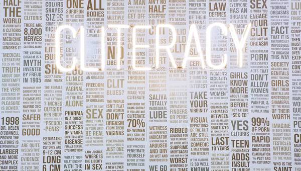
The obvious needs to be stated before anything else can be said: We are avid consumers of celebrity fanfare and pop culture. It’s an inescapable fact of the cosmopolitan lifestyle. Tabloids give us the dirt, paparazzi provide the candids, while exhibitions and premieres put it all on a pedestal in a glitz-grunge cocktail of truth and fiction. The proportions of each may vary from drink to drink, but be it ambrosia or swill, we can rarely resist celebrity libations. James Franco’s second Peres Projects exhibition GAY TOWN dives straight into the deep end of a very distilled blend of this self-referential pop-culture elixir.

Presented in tandem with the films Oz the Great and Powerful and Interior. LeatherBar. at the 2013 Berlinale, Franco’s newest showing opened on February 9th on the grand boulevard of Karl-Marx-Allee to a temporary gallery space packed shoulder to shoulder with art aficionados and gawking Francophiles. Featuring five hundred works in total, the exhibition boasts paintings, videos, projections, mixed media pieces, and a huge collection of digitally printed throw blankets, which line the entire exhibition space top to bottom. The opening event approached levels of spectacle with the commingling of a frenzied crowd and a wall-to-wall installation that sought to conflate the artist’s personal and public, artistic and filmic constructed personas. Parodies of characters such as Spider-Man and Oz, both played by the Palo Alto native, make cameos in various works throughout the exhibition. The ultimate insider-outsider and self-proclaimed master multi-tasker, Franco’s GAY TOWN seems excessively tongue-in-cheek to an almost overwhelming degree. Coupled with the innumerable, repetitive, and seemingly empty references, viewers are left to navigate largely without a clear roadmap of what they are meant to experience. Cows and cowskulls, perhaps tacitly indicative of a herd, are a recurring theme.

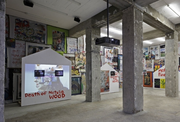
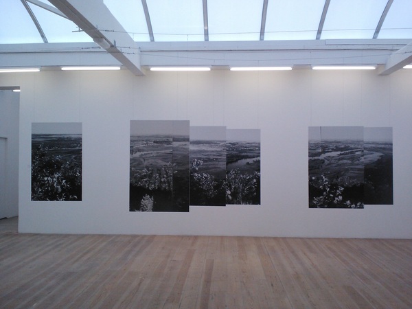
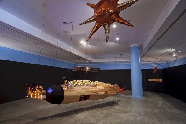
James Franco, Gay Town, Installation View, Peres Projects, Berlin, 2013; Courtesy of the artist and Peres Projects.


Autobiographical in nature, many of Franco’s pieces were created on the go in hotel rooms, movie trailers, and other makeshift studios while working on other projects. Normally icons of private comfort and familiarity, the blankets that take on such a prominent role in GAY TOWN adopt notably different implications when Franco’s self-portraiture is emblazoned upon them, as something cloaking the user.

The elephant in the room, though, is the title of the show itself, which remains unaddressed directly and left unexplained in the official press release. Instead viewers are left to ponder its potential meaning and draw their own conclusions much as they are expected to do with the conglomerate of self-referential blankets and other installation material.

James Franco’s exhibition GAY TOWN runs until March 9th, 2013. On March 1st 2013 Peres Projects will open its new gallery space on Karl-Marx-Allee 82.


Nicole Rodriguez


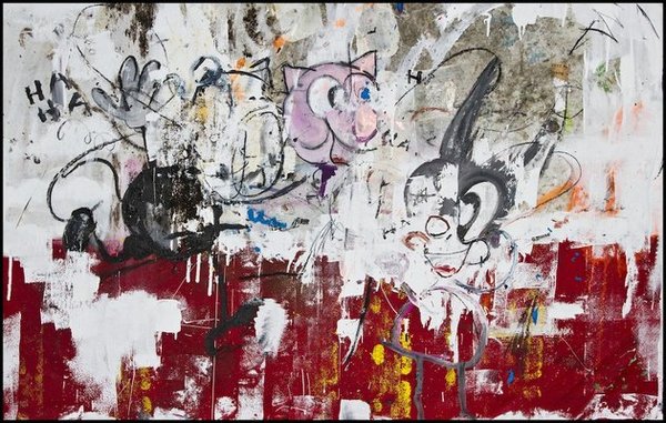
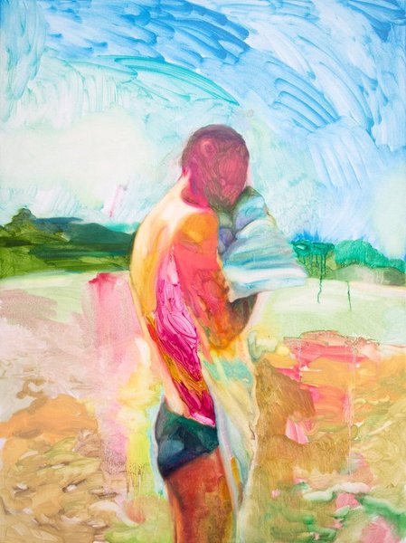
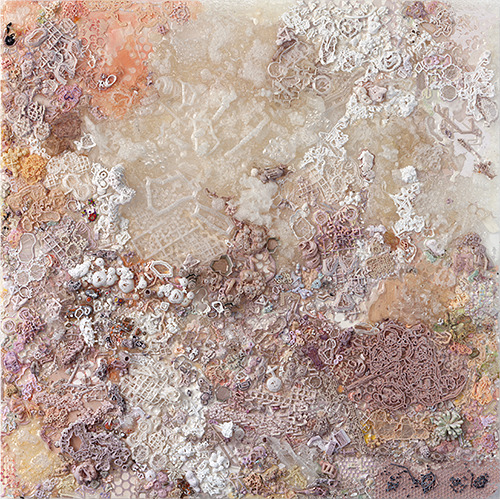
(Image on top: James Franco, White Snow , 2012, oil and mixed media on canvas, 100 x 100 cm; Courtesy of the artist & Peres Projects.)


Child's Play

$
0
0

Like nursery rhymes about the black plague or fairy tales about dictatorial empires, here is a site-specific installation that employs a colorful playfulness in form to access dark and grave content. Galerie Espace Typographie in Paris, where Hema Upadhyay first recreated this dioramic view of miniature slum dwellings in Bombay, is a former textile godown, with natural lighting from a roof made of glass, with echoes from walls made of stone and appearing as a construction or storage site with concrete floors. The Contemporary Arts Center Cincinnati, in contrast, was designed as recently as 2003 by Zaha Hadid, and uses sharp angles and anatomical waves in turn to represent both an ‘urban carpet’ as well as spread an illusion of ‘skin’, ideas that Upadhyay proceeds to manifest in her installation.

You walk through a sea of two dimensional slums, as a voyeur on a meandering route carved out by Upadhyay, so that so that you are at once above, bending forward, peering onto the flat tin roofs, and amidst them. Atop these roofs, lie objects that the artist has found in slums, like fragments of rusted car parts, hairpins, images of gods and goddesses, and children's broken toys. They become, then, failed symbols of movement, beauty, faith and imagination. This is not, however, a romanticization of poverty: the meticulous care with which each roof is glued with these found things that lend them life implies an honest intellectual and aesthetic attachment to the subject.

The yellow and blue color palette is reminiscent of children's classrooms, young drawings of 'the sun and the sky' or even a lego set; however the color, in reality, is the color of the tarpaulin popularly used as slum roofs. The installation is miniaturized, the ideas that it reveals are magnified. This playful gravity between a child's imagination and an adult's reality lends a tension to the installation that is at once taut with commentary and loose with humor. 

Hema Upadhyay, Moderniznation, 2011-13, Installation view at Contemporary Arts Center Cincinnati; courtesy of the artist, photo by Hema Upadhyay.


The only buildings that are in three-dimensions are the temples (in orange), the churches (in white) and the mosques (in green). They rise out of the flat landscape of the slums, where prayers are made in hope for mobility. The colors comprise the Indian flag, as if to imply that it will only fly high in secular honesty. 

There is no sign of a human being and no sign of the natural environment. The light from above glints upon this sprawl of poverty, and pleads you to question what moving forward really means. When you have completed your journey, the yellow and blue city stays behind, replete with all that you have left behind in it, growing as a tumor might.  

But her impassioned views on Moderniz(n)ation arise not in any obvious political or religious statement: whilst the metaphors and symbols she employs are apparent, the artist herself concentrates on form and composition by utilizing the gallery space with intelligent architectural perspective, reflecting, perhaps, how a city must operate its urban planning. 

If Upadhyay's installation was in three-dimensions, you would have been unable to breathe—or find your way out. She gives you space—where there is none. She asks in return for time—to return to our childlike selves, to our first ideas of nationhood and secularism, and ultimately, to the garden, where we might walk, not above the other, but right next to them, barefooted, light. 


Himali Singh Soin


[Image on top: Hema Upadhyay, Moderniznation (final detail), 2011, Aluminum sheets, car scrap, enamel paint, plastic sheets, found objects, m-seal, resin and hardware material wire, enamel paint and photographs; Courtesy of the artist & Contemporary Arts Center Cincinnati.]

The Stillness of Destruction

$
0
0

This twenty-six artist-deep group show that just opened at the Museum of Contemporary Art Chicago is an interesting re-examination of work by renowned artists such as Lucio Fontana, Yves Klein, Robert Rauschenberg and Antoni Tàpies, among others. Re-framed and linked together based on the work’s general responsiveness to war, specifically World War II and the Cold War, all these square pegs are smartly made to fit in round holes despite their typical standing as loners, exceptions, outcasts and iconoclasts. In addition, since artists working across Europe, the United States and Japan have been rounded up here, a prototype of a globalist approach to art making also begins to emerge.

The aforementioned artists’ lyrical, balanced and aestheticized slices, rips, punctures, splashes and sprays almost seem dainty or quaint compared to some of the grotesque physicality of other works in the show which have been flayed, pierced, burnt, scratched and shot, and have the flaked, cracked, wrinkled, sutured, scarred and puckered surfaces to prove it. The real, in all of its violent, but also fragile, materiality is hanging out in this exhibit, and unfortunately, given the visceral nature of many of these works, images just don’t do them justice.

While the title of the show indicates painting as a focus, it can only be understood in the loosest sense of the word. Many of these artists forgo paint in lieu of rocks, sawdust, dirt, tar, rags, and paper, with one of the most extreme examples being that of a slaughtered and skinned boar's hide stuck to a canvas and splattered with gloppy, gutsy red paint (by Kazuo Shiraga, a member of the Japanese Gutai group who also abandoned paint brushes for the soles of his feet, which he used to smear paint onto a canvas while suspended by a rope). Shozo Shimamoto, also a member of Gutai, took to filling glass bottles with pigment and hurling them from a rooftop onto a canvas on the street below. Not only do these gestures turn what had been the hitherto hermetic privacy of an artist’s studio practice inside outside, they make concurrent activities, such as Joseph Beuys’s shamanistic rituals, Jackson Pollock’s oil painting capoeira, and even Mathew Barney’s more recent drawing restraint BDSM, seem theatrical and staged.

Understood in this context, the impact this work has had on contemporary artistic practice makes the case for its renewed relevance. The only catch seems to be that the performative nature of these works’ creation (or is it destruction?) often becomes its central focus — if you don’t know how it’s made, it’s hard to appreciate what you’re looking at.

The exception to this rule can be found in works that also exhibit the most pop sensibility, such as the handful of Nouveau Réaliste pieces by François Dufrêne, Raymond Hains, Mimmo Rotella and Jacques Villeglé. They also bring a pop of color to the show’s otherwise sooty, grimy, muddy, bloody and tallow palette and provide an emotional full-tilt amidst the heavy, and often bleak desperation of some of their neighbors.

Shozo Shimamoto, Taiho no sakuhin (Cannon Picture), 1956. Private collection, courtesy of Axel Vervoordt Gallery, Antwerp. © Associazione Shozo Shimamoto.


In addition, the Nouveau Réaliste Niki de Saint Phalle’s playful “shoot” pieces, made by shooting balloons full of paint attached to a canvas with a gun, are like a loud, comical fart amidst the self-serious, and at times sanctimonious, works in the show. And although some of these other pieces also abandon artistic control in favor of chance operations, Saint Phalle’s pieces don’t die the same slow death, marinating in their own pathos: they were made to be destroyed in an elliptical, snake-swallowing-its-own-tail kind of way. Their destruction leads to their creation — the balloons burst, the canvas is “painted.”

The lucid curation of the former Chief Curator of The Museum of Contemporary Art, Los Angeles, Paul Schimmel, emphasizes another interesting shared element of many of the works in the show. In the best possible Rauschenberg-esque “combine” kind of way, they protrude or digress into the third dimension. Some even go as far as the fourth dimension, exemplified by the lesser known British artist John Latham whose incorporation of painted books onto the surface of his work was originally done with the intention of allowing viewers to be able to leaf through their pages.

John Latham, Untitled, August 1958; Richard Saltoun, London.


The master of it all, in my mind at least, is Lee Bontecou. It’s always a treat to see her work on view at the MCA, given the historic career retrospective they staged of it in 2004. And in her hands, welded steel, canvas and bits of wire don’t just break through the picture plane, they are so unprecedented and inventive that they truly break away from the history and tradition that so many of the other works in this show try desperately to reject, abuse, or reboot.

While the void is evoked throughout the exhibition, it’s slippery and smoky and sneaky until you’re confronted with the monumentality, precision and presence of Bontecou’s complex works. Her work is both the conceptual and material manifestation of the void, where so many others are either/or. Vacillating between two and three dimensions, between hope and despair, between materiality and the unknown, they swallow you up and ooze you out, teasing and terrifying simultaneously. Is that death, destruction, and nothingness we see when we peer into those blackened orifices? Or is it the stillness of rebirth, emerging from womb-like openings?


Thea Liberty Nichols


(Image on top: Lee Bontecou,Untitled, 1962; Manfred and Jennifer Simchowitz © Lee Bontecou; Photo: Brian Forrest.)

A last love letter from a sunsetting civilization

$
0
0

There's hope this might be seen, yet a humbling acceptance of the vast loneliness of space.

It is a gesture.

A last love letter from a sunsetting civilization, a temple left on an abandoned planet, a spare record jettisoned into the cosmos whispering its enigmas through these worn remnants.

Do words fail? Maybe. So do civilizations. After a people’s peak troughs, do objects reclaim their lost souls? The first and last humans doubtlessly were and will be animists. I wish we had a verb for once was and will likely be again but definitely isn’t now. Past-future perfect simultaneous. This language has not yet caught up to the all-over and at-once of real time, the collapsed moment where these objects find themselves.

Coming in out of the sun, a rush of spooky darkness subsides into hallowed half-light, shrouded and ethereal. In the corner, a flickering screen jangles through images. Shot by shot by shot, objects accumulate, pile into knitted sheaths, jutting and fretting through jittery dances. The curious qualities of things take on shuddering life, even here light bends and folds. Every moment accumulated, layered one on top of the other. Year by year, its history lengthens snap by snap, a document of itself. In another corner, bolted to the ceiling dangle a trio of floating heads into this little sanctified bunker. Maybe they’re just hanging out, waiting around for the start of a Beckett play, a sequel to Endgame.

JJ PEET, Floating Head_4 (aka Guts), 2013, Porcelain, terra cotta, mild steel, black plastic bag, cotton and aluminum, 73 x 10 x 10 inches; Courtesy of the Artist and Redling Fine Art.


Their language is not readily decipherable. Uneasy words drop away and only these totems, culled from mild steel and elemental detritus, linger on. Part of the language is objects, for sure. Part of the language is gravity perhaps too, things here both droop down and stretch against. Their weight has its own weft and warp of threaded meaning. The black plastic bag droops, pendulously. Thin metal rods extend like limbs, outward. Malinger too long around them and this reliquary shifts gently into ossuary, each of these floaters taking on their own weird, funereal personality. Part of the language here is also maybe light. Moodily lit rods become bones when brushed with just the right amount of shadow.

The materials, analyzed and listed out, sound their own cryptic poem: porcelain, paper, correction fluid, pine, human hair, black plastic bag, sterling silver, gum, black nylon, cotton. Are they junky? Yes they are kind of junky. But so insistently purposeful, so carefully arranged, balanced and poised, there must be a mysterious intelligence at work, someone who composed these curious and compelling talismans in mute ritual.


Andrew Berardini


(Image on top: JJ PEET, Floating Head_2 (aka Old Lady) , 2013, Porcelain, mild steel, pine, plastic, paper, lime, gum and aluminum, 63 x 16 x 11 inches; Courtesy of the Artist and Redling Fine Art.)

[VIDEO] Martin Kippenberger: Sehr Gut Very Good / Hamburger Bahnhof, Berlin

$
0
0

In 2013 Martin Kippenberger, the enfant terrible of the German art scene, would have celebrated his 60th birthday. On this occasion, Hamburger Bahnhof in Berlin is dedicating a special exhibition to the artist, who died in 1997 due to an excessive life. The show characterizes Martin Kippenberger as an artist, whose work and life cannot be separated from one another, and as an artist, who is considered one of the most significant of his generation. After the last major Martin Kippenberger retrospective entitled The Problem Perspective at the Museum of Modern Art in New York in 2009, the exhibition Martin Kippenberger: Sehr Gut | Very Good at Hamburger Bahnhof is another attempt to approach the life and work of Martin Kippenberger. Kippenberger’s works are exhibited at several places in the building. On display are works such as the painting Paris Bar (1993), and the wall sculpture Zuerst die Füsse (1991) (the infamous crucified frog). In this video, curator Britta Schmitz talks about the artist and the exhibition.

Read and watch more on Vernissage TV.


(Image at top: Martin Kippenberger, Ohne Titel (aus der Serie Lieber Maler, male mir), 1981, Acryl auf Leinwand, 200 x 300 cm; Private Collection © Estate Martin Kippenberger, Galerie Gisela Capitain, Köln.)

Enclaves with double histories

$
0
0

The scraped urban aesthetics of the former Soviet bloc seem to be ubiquitous in contemporary art right now. I guess there's nothing quite like a pale concrete block standing against the sky to satisfy our taste for minimalism and tickle our romantic nerves at the same time. But in Elian Somers' work at SMBA wild greenery is perhaps even more prominent than the built environment.

In her Border Theories series, the Dutch photographer – and architecture graduate – depicts three Russian cities that sit on the extreme outskirts of the country. Hers is a reflection on urban planning and the way it forces an ideological vision upon a territory: the taking over of Soviet culture on former Prussian and Japanese ground in Kaliningrad and Sakhalin respectively, or the failed Socialist Jewish Homeland experiment in Birobidzhan. These cities are “enclaves with double histories”, and in fact Somers' photo captions list both the former and current designations of the places depicted, before and after World War II.

Exhibition view; Courtesy Nicola Bozzi.


Overall, the artist's approach is very research-oriented: along with the exhibition, she produced an homonymous book comprising a few essays and, on March 23, historian and Russia expert Bert Hoppe will give a lecture at the venue about the “virtual history” of Kaliningrad. Dissected in a series of maps and exposed in all its bleak Socialist-futurism – most notably in the only projection on show, on a white monolith – the town seems in fact to be the aesthetic pivot of the project.

Despite its thick philosophical and historiographical implications, though, the actual display at SMBA comes across as refreshingly light. It's true, there are a few black and white maps and a brief introduction at the door is needed, but – for a show that features the word “theories” in its title – Somers' exhibition is not too abstruse. Rather, it invites the visitor to get lost in the gallery space, opening it up instead of zooming in too much. The photo captions, for example, almost always identify a spot as “The city of...”, yet clutter or specific architectural references are often missing from the pictures. In fact, landscapes seem to bleed into the urban environment from all edges, some times framing it and others obscuring it completely. Nature seems to creep in as an unofficial, overhauling protagonist in the artist's narration, manifesting itself in smoky whites or bright greens that often overshadow the aforementioned paleness of Socialist architecture. The best example is perhaps the fragmented black and white photo installation that hangs from the ceiling in the middle of the main room, a black and white natural landscape whose visual and conceptual value meet in subtle discrepancies, which denounce its artificial composition – e.g. on the same panel, sometimes the image is divided in two, with unmatched edges.

Elian Somers, Birobidzhan -Border Theories, 2009–2013; Courtesy of the artist and SMBA.


The specific histories and the research behind Border Theories are definitely intriguing, yet their complexity is elegantly mediated by a sleek and well spaced exhibition experience, which – and this is always good to me – stands on its feet without seeming to need too much explanation.


Nicola Bozzi


(Image on top: Elian Somers, Yuzhno-Sakhalinsk – Border Theories , 2009–2013; Courtesy of the artist and SMBA.)

Thank you SPRING BREAK

$
0
0

New Work Miami2013 currently on view at the Miami Art Museum has churned up several points that are both unremarkable and as unique as the composition of the dirt beneath our feet. In Miami, the bay-dredged soil is composed mainly of oolitic limestone, a mixture of sand and the prehistoric creatures that left their legacy in shell. It is an unusual composition found only in this region.

Engaging in an experimental exhibition format, curators Diana Nawi and Rene Morales encouraged two design-minded artists (Moore and Castaneda) to meddle with the gallery environment and collaborate / co-opt a number of other artists into a mis-en-scène tango. Save for missing a band of pink neon here and there, it is a vain but glorious verisimilitude of the city’s material culture. The resulting exhibition includes some of Miami’s best visual tropes as well as work less explicitly focused on this oceanside metropolis. Described in the curatorial statement as a show composed of a diverse and complex selection of artists from a diverse and complex city, the twelve or so new commissions seem a deliberately random sampling of artists that happen to live in Miami at the moment, rather than a thematic selection of practicing Miami-based artists. Nevertheless the works have gelled into an aesthetically beautiful and well-paced exhibition.

Working with a small but rapidly developing community of artists, the problems of running such a project create a crisis of inclusion, an unavoidable politics of selectivity faced by all institutions engaged with their own local communities. This issue is not new, but was already taking shape in the first New Work Miami, inaugurated in 2010. (2013 is the second installment.) This year the selection process is under increasing scrutiny and public speculation is wavering towards two unglamorous mediocrities: 1) Are we running out of good-enough artists? And, 2) Don’t worry, everyone will get a ride eventually.

Loriel Beltran, Installation view: Unknown Kitchen Monument, 2012, and Unknown Bathroom Monument, 2012; Courtesy Fredric Snitzer Gallery, photo by Michael Swaney.


Yet this unease over selectivity is generative as it unavoidably opens up the divisive and salient issues of the cultural maturation and the quandary of regionalism Miami presently faces – one could argue its greatest and most important challenge in becoming a respected cultural city. This issue has not changed since it was raised by Tom Hollingworth in 2010. When asked Hollingworth was remiss to describe a Miami style, a consistent thematic or aesthetic approach to making art. And we could ask – is this an impossible expectation? Is regionalism and geographic ghettoization a relic of the post-internet world? Certainly not, and developing an aesthetic or identifying broad thematic strands might signal a kind of cultural maturity or at least a coalescing of artistic focus.

This tension is palpable in the city, and it boiled over memorably at a round table discussion at Locust Projects entitled the Miami Vernacular. While not all conversation that evening was objective or necessarily innovative, a raucous debate ensued in which a globalizing force capable of legitimization butted with a quest for underwritten history and a hunger for a more satisfying contemporary identity. As players in the midst of a developing city there lies a responsibility to help to formulate this identity and attempt to create shows that chime with its moment of presentation.

With that said this process runs the risk of reductionism or bullying work into a thematic. In this light perhaps it is useful to talk about form vs. content. If an artist chooses Miami or tropicality as subject matter and shows an interest in vernacularism, this is more or less an issue of content. Likewise practices using the form of reportage or documentary may not be worthy of the same attention as other forms that lend the experience of an original artistic culture. Geographical or regional curating is surely one of contemporary art’s greatest institutional challenges. But the simple question remains: “What is happening here that is not happening anywhere else?”

On this last point New Work Miami 2013 gives hints, which in some cases is better than statements. It alludes to an attention to surfaces (Valdivieso, Holohon); fantasy, faux finish (Beltran) both literally and figuratively; and other important themes such as aspiration (Sanchez-Calderon); elitism and classism, tourism vs. nativisim, the conviviality of excess. Some artists tick some of these boxes but somehow miss the mark, generating little beyond their aesthetics. Moreover, there is a need to put these new works in context with the breakthroughs of Miami’s last generation of artists which commingle with today’s, creating the streak of a continuum as unique as the oolitic soil we stand on.


Amanda Sanfilippo


(Image on top: Tom Scicluna, Public Sculpture, 2012, Miami-Dade Cultural Center Plaza bicycle racks, dimensions variable; Courtesy the artist, photo courtesy MAM.)

Hypnosis

$
0
0

There's part of this job that involves trying to use words to conjure the experience of an artwork or an exhibition for the reader. From the second I entered this show I realised that with the work of Julio le Parc – no chance. There's no way that I can tell you even a fraction of what the experience of being in this show is like. Not least because just finding your way through the first immersive sculpture – a small fully mirrored room full of tightly packed full length hanging mirrors that are slowly rotating – is next to impossible. I was pleased I overheard the gallery attendant telling someone entering after me where the door was. And this wasn't the only moment of total disorientation.

Julio le Parc is an Argentinian Op artist who rose to prominence in the sixties and has since built a fifty-year body of work using the elements of visual disturbance, the play of light and movement, immersion, interaction – and a very particular sensibility.

I have to hand it to the Palais de Tokyo, as Paris' leading institution for contemporary art (in the opinion of this humble journalist), to put someone like him at the forefront of their new season was a great decision; the space perfectly complements the work, and his profile fits that of the institution. This means his work is very good. There's not really another way to express it. It's actually so good that I find it a bit difficult to maintain a critical distance and must add the caveat that it does include a lot of elements of which I'm particularly fond, most notable the ideas of immersion and interaction, and the elements of play. There are few things greater for me than to find myself lost in an artwork, and this I quite literally did several times.

Palais de Tokyo is also big enough and flexible enough to accomodate all of his work. We might say that it's split into two sections: the first is dark, black and white geometric, mirror, light bulbs; the second brightly lit, full of games and containing things with buttons that do things. There are also punch bags.


The thing about Le Parc is the sensibility that I mentioned earlier; it manifests itself as what we could call the antidote to the criticism that is often leveled at Op art, that it's tricksy. What we see with Le Parc is best described as a painterly sensibility – there is strength of line and form, or composition in the plays of light that he creates; they are balanced and discrete if not quiet. Quiet is not an element in this work. It immediately grabs the eye with the captivating strength of light and movement, kind of like a television in the corner of a pub – although obviously much much better. Hypnotic is I guess the word.

Another element I particularly enjoyed was that all of the mechanisms are both obvious and simple; you can understand exactly how the thing is working – again not tricksy – but it simply leaves you aware of the gap between the way it works and the effect it creates, in that one is much bigger than the other. Light builds, small motors, opaque and reflective surfaces, geometrics: there are the tools, and they are very real. The effect can be very close to what we call sublime. Another thing I must mention about mechanics is the sound of the motors that drive the simple movements; metalic hums and the click of switches, they fill the gallery space and form the perfect backdrop to the work – though one imagines the experience of seeing the mirror mobiles would be very different in perfect silence.

As you can probably tell by that last paragraph, I was more taken with the first half of the exhibition than the more playful interactive work later, but this might simply be a product of that fact that I didn't have quite enough time to spend in there, having squandered most of my time in the first half. I must return.

I understand that I've not really described the show but you can do the research yourself. In fact, here is my one criticism: the images supplied by Palais de Tokyo don't really do justice to the work. In conclusion, if you are in Paris I guarantee that if you go and see this show you won't have wasted your time.


James Thompson


(All images:Julio Le Parc; Courtesy of the artist and Palais de Tokyo)


Sorry for Being a Genius

$
0
0

"There is no more chastity in the Young-Girl than there is debauchery. The Young-Girl simply lives as a stranger to her desires, whose coherence is governed by her market-driven superego."Tiqqun, Preliminary Materials for a Theory of a Young-Girl, 2012

Aida Makoto's retrospective exhibit, “Monument for Nothing,” is a stunning body of work, taking full advantage of its towering exhibition site. The Mori Art Museum sits on the 53rd and 54th floors of Roppongi Hills Mori Tower—a massive skyscraper built in 2003. It is the fifth tallest building in Tokyo. As part of one’s ticket price, visitors have access to a sky deck where the whole city extends beneath your feet. On clear days Mt. Fuji juts up from the horizon, as iconic in person as it is in any woodblock print. It’s a museum in the clouds. What better site for one of Japan’s most controversial and celebrated contemporary artists?

Aida Makoto is intent on unearthing latent cultural mores, as someone both implicated in and critical of society’s shadow. While this process is not entirely focused on infantilized women, Aida’s young girls easily eclipse the rest of his work—they burn a persistent impression like an afterimage, emphasizing his unique interest in blending a high-art past with a low-brow manga perversity. AZEMICHI (Path Between Rice Fields) (1991) makes a visual pun of a young girl’s part between pigtails, connecting the back of her hairline seamlessly to a path between rice fields. This work quotes Kaii Higashiyama’s (1908-1999) similarly iconic work Road from 1950—a deceptively simple landscape painting that shows the same unpaved path between green fields. Whereas Higashiyama is famous for creating landscapes that reflect an inner state of mind, Aida’s state of mind is indivisible from the young girl. With a tenderness that verges on pedophilia, the front piece of Aida’s exhibit, Picture of a Waterfall (2007-2010), depicts a vast array of young girls in almost exactly the same track and field uniforms clambering and splashing through a cultivated landscape. There is no difference between the treatment of these girls and the ones in violent compromise.


Aida Makoto, Picture of Waterfall, 2007-10, Acrylic on canvas, 439 x 272 cm.; Collection: The National Museum of Art, Osaka / Courtesy: Mizuma Art Gallery

The young girls in Aida's work are impersonal, and non-specific (even if they have unique physical characteristics). One young girl is as good as any other. Setting aside my tendency as a woman to identify with Aida’s girls, it might be useful to suspend any anatomical correlation and focus instead on the fact that Aida is not presenting real girls, but stylized representations of them. What is especially disconcerting about these representations is that there is something familiar about them. They emerge from a pervasive, cultural subconscious as a kind of archetype. The French collective Tiqqun recognizes this archetype as well and in 1999 coined their own version, the “Young-Girl”—a non-gendered umbrella term. Tiqqun suggests that there are many Young-Girls among us. We might all be Young-Girls, figures that emerge from the spectacle of capitalist society.

Blender (2001), an eight-foot tall painting showing thousands of girls in a giant, expertly rendered blender hangs at the heart of this show. It is impossible to drift past. It is a horrific meditation on violence. These tiny bodies, the sheer number of which blot out any potential for unique individuality, are all naked, all twisting, many smiling, each rendered with such obsessive detail as to feel almost tender. Pinkish water collects at the bottom of the vessel near the blade. Presumably, some invisible giant will consume them. Ash Colored Mountains (2009-11) hangs in the same room, a painting with delicately rendered piles upon piles of salary men, all in suits without eyes—similarly pristine in their illustration, they clutch computer parts. However, they have been cast aside as disposable parts—not even worth eating. The colors are flat and dull, as though all their nutrients have been drained. If these two works describe a gender binary, neither is appealing. It is unfortunate that Aida doesn’t portray the dismal state of more male subjects, as it might further emphasize the bleak reality society imposes on all its constituents. Instead the emphasis lies on the distressing (though not distressed) feminine, what continues to appear like Aida’s familiar—a spiritual or archetypal presence he cannot separate from. The erotic potential of her body and its affliction is the red herring.

Blender and Ash Colored Mountains both offer the same societal portrait from different angles. The Young-Girl suffers the least, even when subject to violence, because she is so impossibly remote (and therefore unpossessable, despite her leering charm). Like the salary men, she is a condition of capitalist society. The Young-Girl is vacuous and torture-able. She has no interiority because she is an image—pure surface. She is the face of capital. "The Young-Girl only excites the desire to vanquish her, to take advantage of her."[i] She is as familiar as any pornographic actor, impossible to reach through the screen she appears upon. She “occupies the central node of the present system of desire,"[ii] and this is what Aida is exploiting, seeming at once excited and anguished by his participation in this system. He is able to draw that perversity out from the margins—particularly referencing Otaku fan-boy culture—bringing its impulses to the fore of society’s consciousness by installing them in a museum. At the heart of his practice, Aida wrestles a distinctly Japanese form of misogyny; a wildly popular though subterranean lust for female naïveté and the exploitation thereof—a tendency that seems to be built on feelings of inadequacy, as the monetary contributions of women undermine the trope of the Salary Man. Aida delves fearlessly into these tropes, exorcising the ghosts of a sadist in public.

Aida Makoto, The Giant Member Fuji versus King Gidora, 1993, Acrylic on acetate film, 310 × 410 cm.; TAKAHASHI collection, Tokyo/Courtesy: Mizuma Art Gallery.

A last room of the exhibit is set aside for those 18 and up. There is a warning against its contents and soft curtains drop from the doorframe. Inside, everything is pleasantly dark, allowing visitors a sense of discretion. We are given permission to dwell on these works, whereas the stark and unflinching Blender took place in broad view. In the back of the Adult Room, we see a giant painting of a woman getting raped by a dragon. A placard on the wall explains that this single piece established Aida’s career. The Giant Member Fuji versus King Gidora (1993) harkens back to The Dream of the Fisherman’s Wife—a famous image of Japanese erotica from an 1814 woodblock print. In that earlier predecessor the woman expresses her pleasure. In Aida’s version, we see a woman with a tear falling from her remote face—this is the only woman crying in the whole exhibit and she does so in the dark. She is on the verge of death, or perhaps just dead. Intimacy with her image as a poignant victim seems almost possible. To the left of that painting Aida masturbates to the kanji for “beautiful young girl” painted on a wall in a sixty-two-minute video. An adjacent placard explains that he was so uncomfortable during the filming, it took him an hour to ejaculate. In the dark, again, we are given a sense of access that the rest of the exhibit denies. The artist would seem awkward in this room, except of course that it’s staged. Like a pornographic film, we can’t trust the narratives provided. Some of the most troubling paintings are hung here—paintings of women with their legs and arms amputated and bandaged—to make them more like dogs. They smile with studded collars. Another series of cruder cartoon-like drawings depict women as food—entirely consumable. Perhaps in an equally direct transferral, photographs show naked women with Aida’s paintings directly on their bodies, rendering the personal, biological material into an impersonal and abstract capital value. Here, we are indulged with a sense of trespass, at once distant and privileged. One feels underground, secure and yet alienated. It is easy to forget how high above the city we are.

People ask if Aida is misogynist all the time. There has been a good deal of healthy outrage around the content of his work for obvious reasons. It is worth noting, however, his delight in provocation, a tendency that is also ubiquitous in all of his works. Yet he maintains an ironic distance throughout (even renaming this show "Sorry for Being a Genius"). Still, there are Aida’s collectors to think about—who buys these works and where are they hanging? I imagine them in high-rise apartments owned by very wealthy men with dubious appetites. It stops being so ironic at that point, as the artist’s distance from the purveyor of desire disappears. Like his viewers in the dark Adult Room, like the Young-Girls he paints, like all of us, Aida is both complicit and exploited.


Caroline Picard


[i] Tiqqun, Preliminary Materials for a Theory of a Young-Girl, 2012, p 42.

[ii] Ibid.


(Image on top: Aida Makoto, Blender , 2001, Acrylic on canvas, 290 x 210.5 cm.; © Mizuma Art Gallery / TAKAHASHI collection, Tokyo.)

Whose Autonomy?

$
0
0

As one of the more visible providers of a critique of the centre/periphery model of cultural development in the early 2000’s, a new exhibition by curator Hou Hanru is highly anticipated. ZiZhiQu: Autonomous Regions at the Times Museum in Guangzhou can perhaps be seen to develop this model as it applies to the cultural self-formation of individuals and groups, placing that development in contrast to a globalised institutionalisation of culture. Autonomy, then, moves across all scales in its realisation. ZiZhiQu presents expressions of autonomy at the level of the personal via the body, as well as the extension of personal autonomy into ideology and geography. In the process this show covers imaginary and real sites of the development and expression of this individual and communal state of being. This show’s tread is necessarily light, as the subject of autonomy quickly enters fraught territory in relation to specific realisations of the autonomous body in society, or its geographical presence.

Taking an example at the extensive end of the scale, China maintains its own series of Autonomous Regions (Xinjiang, Tibet, Inner-Mongolia, Hong Kong, and Macau) that represent, in certain respects, buffer zones, where a balance is maintained between the Mainland system and systems influenced by the local populations or those from neighbouring countries. These particular areas become the actively contested areas of this balance. In ZiZhiQu, the most explicit address of the politics of these local situations is the group Claire Fontaine’s Autonomous Regions of the People’s Republic of China (burnt/unburnt) (2013), which depict the titular areas formed on a wall using thousands of matchsticks. Set alight on the opening day of the show, these left behind their burnt remains on the wall and ceiling. This real and symbolic conflagration seems to toy with the issues of autonomy in China, but it is questionable how far that goes beyond its spectacle.

In another expression of aestheticized violence, Cinthia Marcelle and Tiago Mata Machado’s video O Século (The Century) (2011) presents a view from above of a stretch of road, onto which materials are strewn from off-screen, perhaps from a riot taking place somewhere unseen. The effect is mesmerising and beautiful, yet its meaning in the context of this show is ambiguous.

Of course, some of the strongest methods of art are ambiguity, subterfuge and misdirection, and in ZiZhiQu Hou Hanru focuses on the ways in which artists upset narratives and locations to comment on the nature of autonomy through quixotic interactions of the body with its surroundings, and their creative mimicry of social and governmental systems.

Jun Nguyen-Hatsushiba, Breathing is Free: 12,756.3–Jack and the Guangzhou Bodhi Leaf, 180km,  2013; Courtesy of the artist & Times Museum.


Kimsooja’s series of videos entitled A Needle Woman (1999–2001) places her own, immobile body amongst the massed crowds that flow around her in various parts of the world, adapting themselves to this static figure that remains the one constant in the frame. Nasan Tur presents a similar proposal of disruption, albeit through his somersaulting through spaces (Somersaulting Man [Istanbul][2001–2004]). Jun Nguyen-Hatsushiba undertakes the task of jogging through areas, mapping his presence in the spaces. In a new work he creates a line drawing of a Bodhi leaf “growing” from the tributaries of the Pearl River delta (around which Guangzhou is built), via a 180km jog (Breathing is Free: 12,756.3 – Jack and Guangzhou Bodhi Leaf, 180km [2013]).

Autonomy is also reflected in the impromptu evidence of civilisation in Abraham Cruzvillegas video documents of unofficial structures attached to the landscapes of the Mexican barrios, along with the activities that result in them. The remains of bodily activities are evident in Zheng Guogu and the Yangjiang Group’s opening night, communal performance. The Group approached intoxication as part of the process of performing calligraphy on the bodies of the audience who drank with them. This performance again seems somewhat tangential to the subject of autonomy, compared with Zheng Guogu’s other works (which only appear in the catalogue) in which he records his purchase of land to build his own informal (and semi-legal) structures. These structures seem to stand as provocations to their physical and social surroundings.

China’s Guangdong Province (home of the Yangjiang Group and in which the Times Museum is located) has a history of subversive artistic behaviour. All the Chinese artists in ZiZhiQu hail from this area, and all maintain a certain levity in their practices. Yang Jiechang casts himself in the role of the King of Canton (Canton being an archaic name for the city of Guangzhou), fashioning himself as a set of animated dolls; Lin Yilin stages a series of performances rolling along the ground, pushing at the ankles of a group of people standing in front of his prone body, moving the whole group with his revolutions (Golden Bridge [2011], etc.). Cao Fei’s installation develops away from her longstanding concern with the imagination of the self in the virtual community of Second Life, to create a presentation of her videos in a night-time garden presided over by a statue of Deng Xiaoping (in the process her work losing relevance in the context of this show). The group Xijing Men (Chen Shaoxiong from China, Gimhongsok from Korea, and Tsuyoshi Ozawa from Japan) further develop the absurdities of their mythical state of Xijing, with a passport control at the entrance to the Times Museum which all must pass through.

Rigo 23, Autonomous InterGalactic Space Program, Mixed media installation, work produced in México in collaboration with local artists, 2009-2012; Courtesy of the artist & Times Museum.


The work most directly concerned with the real-world, political effects of a struggle for autonomy, is Rigo 23’s installation produced in collaboration with Mexican artists and influenced by the culture and politics of the Zapatista movement. Several interconnected rooms containing cloth banners, murals and objects relating to the movement lead to a central space displaying hand-made satellites and a large hanging spacecraft. This has been produced as a vision of “a Zapatista Inter Galactic Space Ship,” and holds stitched portraits of balaclava-clad portraits affixed to wicker baskets, and a tiny representation of a dwelling (including miniature basketball court). Such community-focused works seem to well reflect the Zapatista ethos and its creative fight for its autonomy. As naïve as its style might be, this direct expression of a community in the process of striving for autonomy lends a strength to Rigo 23’s presentation which is in contrast to many of the other pieces in ZiZhiQu whose methods and aims can seem overly self-absorbed.

Despite this criticism of the exhibition itself, the catalogue for ZiZhiQu’s is excellent and provides some strong ideas and research around the subject. Ou Ning addresses anarchism as an ideology of autonomy, with its application in the context of the current Occupy movement; Wang Hui provides an extensive critique of regionalism in the Chinese context; and Chen Tong (of the Libreria Borges – an important alternative arts organisation in Guangzhou) provides a condensed account of autonomy in the cultural context of the Guangzhou/Pearl River Delta region; and Hou Hanru’s own introductory essay frames the concept of autonomy better than the works serve as examples of it.


Edward Sanderson


(Image on top: Sriwhana Spong, Beach Study, 2012, 7′30″ 16mm transferred to HD; Courtesy of the artist & Times Museum.)

Dead Kennedys

$
0
0

In May of this year, the Dallas Museum of Art will mount Hotel Texas, an exhibition that brings together the artworks seen in the last hotel room of the late John F. Kennedy. These are the sculptures, the paintings—the sun-burnished nudes and the dreary snowscapes—as seen by the gray-green eyes of the President just hours before his violent death in the motorcade. Each individual piece's quiet observance of Kennedy's final moments is its God-given purpose in this exhibit—an art mausoleum. These works, after all, were not chosen for their dynamism, but for their inertia—as halcyon visual valium for the great American super-class. Alone, as objets d'art, they are important and broad and uninteresting, but as talismans of celebrity death, they are equal parts sacred and ghoulish-profane.

Are we—when viewing, say, a Picasso bronze—exhorted to picture, also, the cubist gore of JFK’s skull, with its newly-abstracted, exploded lines? To imagine the moment of impact on the handsome President's suited, supra-scapular expanse as the scattershot of a gore-tinted Jackson Pollock? The small, pale hands of JFK's wife, Jacqueline, in this picture perform the architect’s task of shaping the cranial fallout into something resembling a head, and her kid gloves—once as white as the cottoned hands of a museum archivist—are immersed in hematic color, the animal red of a Rothko painting. As JG Ballard once suggested to Hans-Ulrich Obrist that JFK's death had become an accepted example of Pop Art in extremis—of quasi-Warholian Death and Destruction, electric chair and Jaguar crash—so this is a Pop Art show: as Pop as Jackie's silkscreen, or as Kennedy's Broadway showtune records.

Second (smaller) Bedroom, Suite 850, Hotel Texas, Fort Worth, Friday, November 22, 1963, Thomas Eakins, Swimming (formerly The Swimming Hole), Charles M. Russell, Lost in a Snowstorm – We Are Friends (formerly Meeting in a Blizzard), Owen Day/Danna Day Henderson Papers, Photo by Byron Scott.

———

An aside:

The catalogue listings and Kennedy's autopsy papers even assume a structural kinship—here the location, and there the embellishment; here the numeric details, thus:

The Master Bedroom, which was designated as Jacqueline Kennedy’s bedroom, was adorned with Impressionist masterworks, per her well-known affinity for the genre. The room included Summer Day in the Park, 1918–23, by Maurice Brazil Prendergast; Vincent van Gogh’s Road with Peasant Shouldering a Spade, 1887; John Marin’s watercolor Sea and Rocks, 1919; and Bassin de Deauville, an oil on canvas by Raoul Dufy from 1926.

Versus:

The large, irregularly shaped defect in the right side of the head (chiefly to the parietal bone, but also involving the temporal and occipital bone is described as being about 13 cm (5 inches) wide at the largest diameter. The other missile [the bullet to the back] entered the right superior posterior thorax above the scapula, and traversed the soft tissues of the supra-scapular and the supra-clavicular portions of the base of the right side of the neck.

———

The works in the suite were chosen, in 1963, by “a small group of Fort Worth art collectors,” on behalf of the Presidential couple; this total disconnect from the actual, tactual influence of the Kennedys lends the exercise of regrouping the items the ghoulish wax of voyeurism. This is the Zapruder film as masturbatory object—a paraphilic view of the hotel suite as a pomo snuff film waiting-room. Assassination, in this scenario, becomes an abstract kind of super-sex, where every move is the psycho-buildup to bombastic blast. The still begets the storm; the silence, the violent denouement—the sheer, unbearable weight of the Van Gogh landscape begets the open expanse of the President's brain. Suite eight-five-oh is the scene of the establishing shot; the action takes place for a different camera—Zapruder's—but thankfully, its climax is documented.

If JFK's death is to be “Pop” proper, it needs a golden media image.

The question, maybe—perhaps inanswerable—is whether this National Enquirer approach to art curation is obscene, or visionary. If general proximity to celebrity mort violente is enough to guarantee a work as a masterpiece of Pop, what does this mean? When an Ebay seller auctioned-off the shooter’s perch window—removed from the Texas 
School Book Depository—back in 2007, why was the item worth three million dollars? One internet commenter, underneath an article about this purchase, asks an even more pertinent question, “Is this historical or is it sexual?”

“Is this historical, or is it sexual?” Is this a show about art, or death, or a show about popular culture—about the moveable spaces between all three of these things, and the places where they collide? The show's curator, Oliver Meslay, has said that Hotel Texas is "not a story about death, or a story about hate. It's a story about art and love.” The story of JFK in actuality, though, is one in which death is important. So, too, is hate, and the tireless pursuit of orgasm —the “little death.”

(“Kennedy,” an acquaintance of the President said, “was a compulsive, even pathological adulterer. I knew he treated women like whores.”)

The ultimate meaning of Hotel Texas is moot. What matters is that it is a new kind of real-life Atrocity Exhibition—historical tourism with a catalogue, “Let's Go To Golgotha” style. With hindsight—20/20, as a sniper's eye—we can view the Kennedys' rented artworks, and be filled with the warm reassurance of certainty, and of human mortality: real and inescapable, and bloody.

The artwork-handler mops up the last of the gore with their gloves.


Philippa Snow


(top image courtesy Amon Center Museum of American Art Archives, Byron Scott / Associated Press; uncredited images of JFK assassination courtesy of their respective authors.)

Upping the Ante: Armory Arts Week 2013

$
0
0

With the arrival of Armory Week, last year’s experiment of Armory versus Frieze is rearing its ugly head, and settling itself into reality. The splash that Frieze made last year on the enchanted (Roosevelt) Island of art lured satellite fairs Pulse and NADA to jump ship from March to May, but Scope, Fountain and the Armory’s little sister, VOLTA, remain Armory Week fixtures. To up their game, both Scope and VOLTA have shed their trade-show like skins, and relocated to historic (and more accessible) venues, following Fountain’s lead last year with their move from the Frying Pan to the gorgeous 69th Regiment Armory.

The Armory Show planted its foot in the now by joining forces with Artsy (which is no longer Art.sy…) by presenting a thorough digital preview of what to expect at both piers. The online preview is far less intimidating than the throngs of people and endless booths at the fair, but of course not as fun. However, the entire fair is neatly organized and accessible with categories like Surrealistic/Fantastic, Women Artists and Figuration: Post-War to Now. Browsing the digital files is given more substance with selections, quotes and writings from guest curators Eric Shiner, John Elderfield, Howard Rachofsky and Dasha Zhukova.

Winston Chmielinski, Rub Dry, 2012, oil on canvas, 48 x 36 inches; courtesy of envoy enterprises. At Volta NY.

In anticipation of an influx of new visitors this year, VOLTA has made a move from the stuffy trade show-feeling venue in blasé Herald Square to a gorgeous hardwood 19th-century loft building in SoHo. Aside from the sparkly new venue, VOLTA promises to thoroughly educate its visitors by presenting a program of emerging artists like Winston Chmielinski to Venice Biennale veteran Radomir Damnjan. VOLTA’s programming pushes even further, by engaging visitors with the forefront of defining Caribbean art in ARC Magazine’s roundtable discussion with artists Heino Schmid, Charles Campbell and Christopher Cozier, with Michelle Joan Wilkinson and Editor-in-Chief Holly Bynoe.

SCOPE is also upping its ante, relocating to the beautiful (and beautifully accessible) former post office, Skylight at Moynihan Station, across from Penn Station. This year’s special programming is highlighted with a site-specific installation by Pop Surrealist master (and recent Simpsons character) Ron English. Ever criticizing the over-consumerism of American culture, Culture Jam Supermarket will be a sharp commentary on advertising and our adjusted acceptance of social norms. Sonic Youth guitarist and long time visual artist Lee Ranaldo will show his ink and oils at the Whitehot Presents booth, part of the fair’s Breeder program, which fosters emerging galleries and curators. Highlights from exhibitors will also appear on the Google FieldTrip app for Android, in a partnership with Art Nerd New York.

Sophia Wallace, CLITERACY: 100 Natural Laws; courtesy of Baang & Burne Contemporary. At Scope, part of the Breeder Program.

Marking the 100-year anniversary of the seminal Armory Show of 1913 at the 69th Regiment, Fountain Art Fair will honor the historic fair that originally showed its namesake—Marcel Duchamp’s Fountain readymade. In celebration, they’ve partnered with Robots Will Kill and Mighty Tanaka to transform the Armory’s rafters into an oversized hanging street art installation. Twenty canvases will drape the historic ceiling with site-specific works by different sects of the New York street art community.

The war of the New York art fair weeks continues for a second round, with the predicted snowfall already throwing a wrench in Armory Week’s victory plans. Will changing up venues and amping up special installations bring Armory Week in for the win? Time will tell.


Lori Zimmer


(Image at top: Bjarne Melgaard, at the booth of Guido W. Baudach, Greene Naftali & Krinzinger, Armory Show 2012; photo by Natalie Hegert.)

The Overlooked Object: An Interview with Michael Zelehoski at VOLTA

$
0
0

Michael Zelehoski won the ArtSlant Prize in 2008, the first year the competition ran. Since, his career has only been gaining steam, having two solo shows a year and making the rounds of the fair circuit. I sat down with him in his home/studio in Beacon, NY as he readied his installation, WALL ART for Ethan Cohen Fine Arts’ booth at Volta.

Joel Kuennen: Where were you at in your career when you won the ArtSlant Prize?

Michael Zelehoski: Nowhere, basically. [laughs] I was showing a little bit in local galleries in Western Massachusetts and getting a decent response but my work had no reach. The Art World is very tiny, for better or worse. It does make it manageable but it can be hard to break in. That ArtSlant show at Fountain in New York was really the exposure I needed. I got gallery representation almost immediately as a result of that show.

JK: Did you make sales?

MZ: No. None of us sold anything. Although I still, to this day, run into people who tell me they kick themselves for not buying at Fountain. [laughs]

JK: How has your work transformed since then?

MZ: At that point, I was just starting to figure out how to really transpose three-dimensional reality into two-dimensional space and how to do so faithfully, to represent the object as it would look from a real perspective, in real space. Then I started experimenting with ideas of fragmentation, composition, what the process of collapsing an object actually entails and leaving things slightly unresolved so that the viewer has a similar experience looking at a work as I did making it. We’re always visualizing things when we interact with reality. Our brain is making sense of what it sees as we change perspective, filling in the gaps. When you visualize a chair in your head, it’s pretty easy to see a chair. But the second you try to zoom in on it, or to focus on it in your head, it becomes fragmented. It becomes elusive. My compositions now resemble more of that idea of an object than the actual object in reality.

JK: What draws you to the overlooked object?

MZ: It’s much more meaningful to take an object that would be overlooked, one that doesn’t have a definite, specific universal meaning and reveal something. To bring those humble objects into the realm of art is meaningful for me. These objects are formally and phenomenologically interesting in their own right but easy to overlook. When you bring them into the picture plane, into this space that we associate with art specifically then people can look at a board, for instance, differently.

JK: A lot of materials you are using now in your work are structure, scaffold, what supports the artifice. We’re sitting here, surrounded by the unfinished walls of this studio and that reminds me of your work; it refuses the surface, through representing surface and thereby representing the structure behind it.

MZ: Yeah, absolutely. Building this studio was a pretty amazing experience. It coincided with the flattening of an actual building (Open House, 2012). So as I was collapsing a building into two-dimensional space, I was adding volume to this space. I find the structural underpinnings— everything that’s essential but invisible—of interest. I find the supports that a canvas is stretched on just as interesting as whatever has been painted on that canvas. To create illusion is legitimate but we live in a world where we are constantly bombarded by imagery already so to create another image and to labor over it through some obscure technology just doesn’t do it for me. If you’re trying to represent something, why not use the thing itself? Why not bring us back to materiality and the physical reality instead of bringing us farther into the abstract realm of pigment and light?

JK: What do you think is lost from representational abstraction?

MZ: It depends. Literally everything. Semantically, maybe nothing. There is a lot more to our interactions with objects, as with people, than just the visual. It’s also the phenomenological interactions we have with objects, whether we can feel the history of that object, in its very materiality, in the tree that grew, was cut down and made into something that lived a utilitarian existence as an object. When we come into direct contact with something, we can feel it on a level we perhaps couldn’t if we just saw a picture of it.

JK: You’re showing with Ethan Cohen Fine Arts at Volta, could you talk a bit about what you have planned?

MZ: I was playing with this idea of the Art Fair: they’ve become ubiquitous; they’ve become necessary. Artists can complain but it’s still true that they are necessary right now. They are a great way to see art, aside from obvious drawbacks, and a great way to show art and have a lot of people see it, but at the end of the day it’s a tradeshow and it’s all about commodification. In recent years, works have gotten smaller, safer. Galleries might be hurting, they need to break even so they bring work they know will do well, work that will scream loud enough from the walls that you’ll see it amongst the cacophony of other work and small enough that you can carry it out under your arm. It’s sad; I miss ambitious installations, work that might elude commodification and instant recognition – time based work, subtle work that doesn’t do well at fairs. Miami is a feeding frenzy and we sold out; it’s what we’re there to do but at the same time the contrarian in me wants to create a booth in which the work will be literally inaccessible, in which a series of objects that are associated with artistic production, objects that are basically a means to an end are going to become ends in themselves and literally built into the walls so they can’t be bought or sold. My gallerist, of course, asked, “We are going to sell them, right?” [laughs] I’m like, “Yeah, don’t worry about it, we’ll figure it out.” We haven’t really gotten there yet, but for the moment, it’s going to be a statement. Nobody gets anything.

JK: [laughs] He’s been really good about it?

MZ: He’s been a good sport. He made us money in Miami and I told him there would be some other work to back this up that he can sell off the iPad. For me as an artist, the long-term trajectory is much more interesting than the sale today or tomorrow. I’d much rather not sell anything now and make art that transcends in some way. That’s the other issue with art fairs; your work is up for three days and then goes into a collection and is never seen again. I’m in a few collections now but I am just getting to that point in my career.


Joel Kuennen


(All images:  Courtesy of Michael Zelehoski.)

Graphene and Glitter: Shane Hope's Molecular Realities

$
0
0

Shane Hope makes invisible worlds visible. Leaders in the world of digital art have called his work “the warmest use of digital technology out there.” This week the New York artist’s uniquely fabricated sculptures, digital paintings, and holographic prints will be the feature of Ed Winkleman’s booth at the Armory Show.

If one could wield a brush on a molecular level, the outcome may resemble Hope’s stunning creations. Using molecular modeling software suites, he explodes the parameters and renders compounds both possible and not, creating densely layered, intensely colorful images that are packed with content which remains largely indecipherable. Hope takes this impenetrability to exquisite extremes in his reliefs, which like his prints are the result of impossible instructions fed into systems unused to such subversion. These constructions acquire further complexity in the form of sculptural reliefs, which Hope produces using homebuilt 3D printers, crating masses of layered, intricate chemical models in the multicolored thermoplastics used industrially for rapid prototyping.

Does Hope’s artwork cross into the realm of science fiction? Perhaps. Winklemann describes his work as “simulations of futuristic technologies that are not available yet, but scientists believe will be someday.” Through Hope's coding and computerized fabrication the viewer is allowed the kind of view into the atomic and subatomic that can usually only be found in specialized demonstrations, whether it is IBM research fellows spelling out the corporate masthead with atoms, or Ray and Charles Eames picturing cosmic timescales in their landmark Powers of Ten.

Shane Hope, "Femtofacturin' Fluidentifried-Fleshionistas", 2012 , 3D-printed PLA molecular models on acrylic substrate, 24" x 24"; Courtesy of the artist.


Hope’s work encourages questions of relativity. How, for example, in our age of near total virtualized adjacency, are we to form our own senses of scale? As we magnify our perspectives, extending our perimeters of knowledge into expanses once unseen and unimagined, the ways in which to resolve such problems of reference seem to be vanishing. Perhaps it could be that this planet has exceeded our ability to comprehend it, as it appears that amid the complex infrastructures that allow our world to function, it is very ubiquity of such intricacy that obscures these systems, allowing for an ignorance that is only questioned in stoppages or failures of life governing arrangements.

In these elaborately computer crafted prints and sculptures, the forms of compression we commonly apply to information are removed, and though these restraints are lifted, the consequences are only partially revealed, with part always remaining hidden in its own unfolding complexity. Some part of the future is here to be seen, and it is not the popular doomsday scenario of machines consuming the earth in an endlessly replicated grey goo; through this lens, what lies ahead is a time of manufactured plenty, when the greatest problem will simply be our ability to keep pace with ourselves. Both problems to be worked out, no doubt, if science will allow.


Collin Sundt


(Image on top: Shane Hope, "Sentient-Soppin' See-Source-Serum",  2012, 3D-printed PLA molecular models on acrylic substrate, 24" x 24"; Courtesy of the artist.)

Welche Mauer? / Which Wall?

$
0
0

There are two walls in Berlin. The first, the historic and notorious Berlin Wall of Honecker and Kennedy that bisected a nation, dividing families, constructing prejudices and casting an XL cloak of doubt and shame on a people. This, the much loathed and bemoaned geographical scar, was observed on television sets worldwide with elation and danced upon as it came crashing down in 1989. A city’s demons seemingly exorcised. A new frontier rolling out the red carpet.

And then there is the 1.3-kilometer stretch of concrete that snakes along the Spree on Mühlenstraße on the border of the Friedrichshain and Kreuzberg districts of Berlin today. Although made of the same material and constructed for the same purpose, it no longer stands as quite the same structure, having been renovated and revitalized for a very different cause. Repurposed with more than paint, this stretch has become a shrine to remembrance and a canvas for the free speech it once stood as a symbol against. In 1990, artists from across the world, including Siegfried Santoni, Thierry Noir, Bobo Sperly, Dimitri Vrubeland, and  many others, were invited to paint on the wall, to create murals and, simultaneously, a historical document that would testify to the politics and emotions that were imbued in that iconic structure for so many decades.

Today what is known as the East Side Gallery—one part satire, three parts historical artifact—is the largest and longest-lasting outdoor gallery in the world (as well as the longest surviving section of the Berlin Wall), challenging both the elements and the concept of what a gallery woulda-coulda-shoulda. Founded by the two municipal artist associations of the city, the BBK (Bundesverband Bildender Künstlerinnen und Künstler) and the VBK (Verein Berliner Künstler), the oldest association of artists in Germany, the East Side Gallery is less a division as it is punctuation, an ending and a forewarning of an inevitable new beginning.

This is Berlin’s second wall, the one that boasts caricatures and slogans like “Many small people, who in many small places, do many small things, can alter the face of the world,” and is what Berliners are now protesting the destruction of today. As the city’s hearts and sidewalks begin to thaw with the first sunny days after one of those infamously dreary Berlin winters, thousands are flocking to East Side Gallery to protest the removal of some sections of the wall. The scheduled replacement to the historic monument? Luxury apartments.

On Sunday, March 3rd, approximately 6,000 people stood vigil with protest signs and heavy hearts in the attempt to ward off the powers that be. Above the crowd, bobbing in and out of busy heads was a poster with the slogan “Welche Mauer?”  (“Which wall?”). A profoundly deep statement I find myself steeped in. It’s true that there is some stranger-than-fiction irony in Berliners gathering to try saving the very concrete they had once died trying to escape over. But the question holds. Is this the same wall? Like a scar that becomes some inextricable marker of experience, the East Side Gallery and other stretches of the Mauer ring true as a sobering reminder of the past, but also as a marker of all that has been accomplished. Its destruction would mean the loss of a symbol of collective consciousness, a document of the sense of freedom and opportunity that now permeate the city’s now famous spirit and social fabric.

Welche Mauer do they think they’re removing?


Nicole Rodriguez


(All images: Courtesy of East Side Gallery.)


Armory 2013: An alien's A-Z of New York's premier art fair

$
0
0

A is for...

Art. Obviously. 

B is for...

Bloomberg. Read his speech in a particularly dispassionate manner, but apparently the Armory show is 'fun, and good for the economy!' 

C is for..

Champagne. Free Pommery from 12 - 1 for some. Kudos for being the fair to crack open the booze earliest. 

D is for... 

Daytime drunks. Following indulgence in above mentioned compacted time frame.

E is for... 

Elitism. it still abounds, even across the pond.

F is for..

Faux casual. The Armory Show look du jour; trying too hard to really be relaxed.

G is for... 

Gallery girls. The honey traps of the art world.

H is for... 

Hectic. The Armory Show is just the start - next up is The Art Show, Independent, Moving Image, SCOPE, Volta and countless others opening this week.

I is for…

Investment pieces: subtle but enduring. Cindy Sherman or a neon light piece by Tim Noble and Sue Webster is top of our wish list from this year's exhibitors.

J is for…

Jolie-laideur. Like gross 'still life' video-paintings by Chinese artist Wang Gongxin.

K is for… 

Kissing. Of the air variety bien sur. Though notably less of this compared to European fairs. Americans are clearly frigid. 

L is for… 

Lists. Press? collector? dealer? industry professional? V.I.P? morning preview? lunch time preview? afternoon preview? pre-opening? opening? I don't even know my own name anymore.

M is for… 

Money. It's all about the moolah, all said and done. 

N is for... 

Next big thing. But hang on, wasn't it supposed to be that other one... 

O is for... 

Oh god, I'm running out of steam with this.

P is for... 

Piers: 94 vs 92.

Q is for... 

Quixotic galleristas. Find one who isn't.

R is for... 

Roller decks. Stack, swap and repeat.

S is for... 

Showcase. Currently ranking high on the most overused words in art speak, alongside fellow siblient, 'satellite event'.

T is for... 

Turtlenecks. In surprisingly low numbers, despite the bracing winds. 

U is for... 

Unfinished. As some of the works appeared to be. And as this A-Z is, before we get to the tricky letters. 


Charlotte Jansen

(Image on top: Champagne bar at the Armory ; © photo by Natalie Hegert)

What Do We Owe Picasso?

$
0
0

There is no shortage of Pablo Picasso exhibitions in our world right now – a good half-dozen major shows have opened and closed across the U.S. in the past three years, exploring everything from Picasso’s relationship with women to his relationship with other artists. Now, the Art Institute of Chicago has opened their own exhibition, “Picasso and Chicago,” adding Picasso’s relationships with cities to that list.

The premise of the exhibition is a celebration of the 100th anniversary of the first exhibition of Picasso in the United States, made possible back in 1913 by the Art Institute. The debut of modern art in America happened at the 1913 Armory Show in New York City, which famously featured work by Henri Matisse, Georges Braque, Marcel Duchamp and, of course, Picasso. After the Armory Show, the exhibit toured to the Art Institute, where it delighted the local audience. As part of this 100-year celebration, the Art Institute has set up an online exhibition featuring an interactive map of the original show.

“Picasso and Chicago” takes great ownership of the Art Institute’s role in Picasso’s career, which, they claim, was the first presentation of his work in an American Art Museum, the first solo non-commercial show and the first permanent display of his work. Chicago, the exhibition assures, has been a significant force in supporting great artists, particularly the great Picasso.

Pablo Picasso, Head of a Woman, 1909, Courtesy The Art Institute of Chicago, Edward E. Ayer Endowment Fund in memory of Charles L. Hutchinson/ © 2013 Estate of Pablo Picasso / Artists Rights Society (ARS), New York.


There are no surprises here – the exhibition seems to be an unapologetic send up of a beloved artist. Designed for Picasso experts and novices alike, the exhibition covers the long span of his career in depth while exploring the multitude of mediums he employed without cliché. Some greatest hits are there – Mother and Child (1921), The Red Armchair (1931), and The Old Guitarist (1903), and you will undoubtedly have difficulty getting close enough to see many of them. His painting Half Length Female Nude (1906) is a portrait of a haunted woman, a clear precursor to Desmoiselles d’Avignon (1907). Picasso’s “Head of Woman” series from his cubist period, transitions from drawing to sculpture to painting and works as an excellent study of the artist and his craft. The sculpture, Head of Woman, Fernande from 1909 is particularly interesting, since he manages to flatten the perspective of the work without losing the perception of volume.

The most rewarding works, however, are his etchings, particularly the ones he did for “Texts of Bufon.” The prints feature simple line drawings of Picasso’s interpretation of what a seventeenth-century naturalist might have considered some animals to looks like; the resulting turkey looks more like a cotton puff than a holiday bird. The wings of his dragonfly have a wavering fierceness to them – more quiver than insect – and his ostrich has the kinetic silliness of a Warner Brothers cartoon. The “Minotaurmania” series is full of densely packed illustrations of a man-monster that hearken to his later masterwork, Guernica (1937), while maintaining the vague flavor of a Maurice Sendak illustration. The entire drawings and illustrations room reveals a less-aggrandizing artist that speaks well to his talent and prolificacy.


Pablo Picasso, Minotaur and Wounded Horse, 1935, Courtesy The Art Institute of Chicago, Anonymous gift. © 2013 Estate of Pablo Picasso / Artists Rights Society (ARS), New York.


Picasso needs no advocate, however. As one of the twentieth century’s most fertile artists, Picasso is certainly its most over-represented. A survey referenced by David Galenson in his book, The Most Important Works of Art of the Twentieth Century, placed two of Picasso’s artworks in the top ten, with Desmoiselles d’Avignon ranking number one. His position on the frontlines of modernism makes him an unwilling advocate for many discussions about contemporary art and his popular reach is exceeded by few other artists. He was never “just” a painter, but always working in multiple media and unafraid to combine them. Very interdisciplinary, one may say.

What still seems like a stretch, though, is the huge exhibition and museum-wide programming dedicated to a man who never set foot in the United States, let alone Chicago. Is this a way of turning Picasso into some sort of spirit animal for Chicago, or is this an apologia for denying him and his peace delegation an entry visa back in 1950? Is this a way of embracing him as one of our own after keeping him on an FBI watch list for twenty-five years?

“Picasso and Chicago” should be a proxy for a lot of other relationships this city has had with artists that go underexplored. While themed exhibitions around locales can be a provincial exercise, the question that haunted me throughout the exhibition is “Who is he standing in for?” How many artists with deep soulful ties to Chicago are still waiting for the city to acknowledge their contributions?

Go see “Picasso and Chicago;” your out-of-town guests will enjoy it, and you’ll be pleasantly surprised by the prints and drawings. If you happen to miss it, however, I’m sure you’ll be able to catch up with Picasso in another, nearby burgh.


Sarah Hamilton


(Image on top: Pablo Picasso, Mother and Child , 1921; Courtesy The Art Institute of Chicago, restricted gift of Maymar Corporation, Mrs. Maurice L.Rothschild, and Mr. and Mrs. Chauncey McCormick; Mary and Leigh Block Fund; Ada Turnbull Hertle Endowment; through prior gift of Mr. and Mrs. Edwin E. Hokin. © 2013 Estat.)

The Art of the Wall and the Spirit of Berlin

$
0
0

There’s been a lot of talk this week about the current state of the East Side Gallery. Thousands of people, including myself, have expressed their outrage at the city of Berlin and the profit-driven property developers for carelessly dismantling one of the city’s most treasured landmarks. (A current petition on change.org holds over 70,000 signatures.) “It’s a part of history!” we shout. “No more expensive housing!” we plea. Up to this point, the protests and arguments have centered on the Wall as historical artifact and its recent commodification as a site for potential luxury condominiums. Yes, that’s right. They’re tearing it down to put up a parking lot.

These condominiums are slated to be built on the former Todesstreifen. The “Death Strip” is an area next to the wall where border guards were given shoot-to-kill orders regarding those attempting to flee the DDR. The East Side Gallery undoubtedly serves as a critical memorial to the Cold War and its casualties – but what about its function as public sculpture? What of its importance as a site worth saving for generations that do not know of the Wall’s original intent? How is this work any different from the art-historical importance of the Caves of Lascaux or the collective memorial of Ground Zero in New York? The open-air gallery, possibly the largest of its kind in the world, showcases the tireless efforts of artists from across the globe. These artists came together to transform a symbol of oppression into a universal bastion of hope in a freshly reunified Germany. The Gallery is more than just a memorial; it is an invaluable work of public art that deserves to be preserved as an icon of human resilience.


The artists Karina Bjerregaard (right) and Lotte Haubart (left) after restoring the painting in 2000

I spoke on the phone this week with the Danish artist whose painting has already been partially removed from the Gallery. I had a difficult time finding her. The sliver of concrete that has already been removed from the Wall is the only piece of the painting with her name on it. None of the articles I have seen circulating in the German press have mentioned her at all. The volunteer “security guard”, stationed to prevent further destruction to the Gallery, did not seem to be familiar with her either. It appears the identity of the artist(s) and the specific work(s) is of no concern, which I find to be a piece of the conversation that is sorely missing. Karina Bjerregaard is her name and she, along with her collaborator, Lotte Haubart, produced the painting Himlen Over Berlin in 1990 next to 103 of their fellow artists-in-arms. There is powerful force in the action of painting over history to make new, rather than tearing it down, and I could hear it in her voice as she described her relationship to the Gallery and this work over the years.   

We spoke about the fragility of public works – both from vandals that write graffiti on its surfaces to shortsighted public officials threatening its preservation. "In 2009 we went down to restore the painting for the 20th anniversary commemoration. I vividly remember Klaus Wowereit (the Mayor of Berlin) giving a very moving speech on the importance of this work. He said that we must never forget how happy it made us in the 90s and we must ensure its continuation into the future. Five years later and he's involved in its destruction. Isn't that ironic?"

Our conversation wandered to the topic of Berlin itself and what it was like after reunification: “There was an energy to the city that I had never felt anywhere before. The [Berlin] underground felt like it opened up to everyone.” We spoke about how she took a train from Copenhagen to Berlin without speaking to anyone involved with the project. Her participation arose when a Danish reporter had mentioned that there was no current representation from Denmark in the team of artists working on the project. Bjerregaard and Haubart were bent on changing that and arrived at the Wall with their paintbrushes in hand, were given a spot, and started to work. “That’s how it was back then. It was a very Berlin way of doing things,” she recounted as our long-distance cellular connection crackled. “There was no internet, no cellphones. If you wanted to do something you just showed up. We spoke to a woman and told her what we wanted to do. She liked it and said, ‘Here’s a piece of wall. This is yours.’” This sentiment and sense of camaraderie has been an undeniable driving force in Berlin for the last two decades. It is arguably the main reason the city has flourished into an international community of artists and creatives today.

Berlin Wall, photo by Parker Tilghman.


The paintings on the East Side Gallery are more than just decoration or a brightly hued tourist attraction. They deftly represent one of the many valuable functions of Art and its necessity to the human experience: these paintings possess the ability to transcend fear and oppression, to make whole again through emotional, visual communication. They are markers in time that memorialize not only the hardships of a divided nation, but more importantly the moment of human coalescence in triumph through art. Tearing down the Gallery to make way for luxury commerce will destroy more than cultural history, it will cut a hole in the spirit of Berlin and its artistic community.


Parker Tilghman


[Image on top: Karina Bjerregaard and Lotte Haubart, Himlen Over Berlin, 1990 (image of intact painting from 2009), East Side Gallery; Courtesy of the artists.]

From the Vernissage Floor: Armory Week in 48 Hours

$
0
0

In the last forty-eight hours I’ve walked through six fairs, looked over the presentations of more than 350 galleries, and seen the work of more than 1000 artists. If pressed to put an adjective to the experience, I’d choose enthusiastic, because when you attend these sorts of events in the first few days of the run everyone is pretty hopeful. Everyone smiles, and if you can keep your tradeshow cynicism at bay, you can soak up some of the excitement and be energized. The trick is to not take everything so seriously. After all the chances of an art expo having a major cultural impact are pretty slim; I think it’s impressive that it’s even happened once in the last century.

This art bender began for me at an old school house in Soho where twenty-some-odd NYC-based curators filled classrooms, bathrooms, hallways, and stairwells with artworks based on the theme of New Mysticism. Billed as the Spring Break Art Show, this is the local’s fair and it boasts the most immersive spaces. One room recreates a weird little research bunker based on a CIA operative’s covert LSD investigations. Another room is covered in foil. It turns out video installations also work rather well in old classrooms, plus you can doodle on a desk if your attention wavers.

I thought of The Spring Break Art Show as the appetizer to the big dish: The Armory Show. Thanks to Liz Magic Laser I know for sure now that I don’t fit this fair’s average demographic. Laser was commissioned to shape the fair’s graphic identity, which largely boils down to designing the tote bags, staff t-shirts, and VIP passes. Laser had these emblazoned with statistics and facts meant to give an air of transparency to the fair. Average fair goer: forty-four years old. Average income: over a quarter million.

The Armory Focus, curated this year by Eric Shiner, is particularly good. And I was enormously skeptical about the conceit, which is to showcase America. Perhaps unsurprisingly Shiner took a bit of a Warholian bent (he’s head curator of the Warhol Museum in Pittsburgh) and situated a work by Charles Lutz at the show’s entrance. Babel (Stockholm Type) (2013) was a stack of cardboard Brillo boxes that visitors were encouraged to dissemble and take away. The result was seeing Brillo boxes under arms everywhere.

'

Myla Dalbesio, Juliana Cerqueira Leite, Grace Villamil, alonetogether, curated by Amanda Schmitt; at Spring Break Art Show, photo by Natalie Hegert.


After a while I left the Armory and walked down the street to the UnFair, a pop-up exhibition on the second floor of an old manufacturing building. In order to get to the second floor you ride in a rickety elevator with a comedian who tells quick jokes with catchy punch lines. As an homage to Felix Gonzalez Torres, there is a cooler full of free Ben & Jerry’s ice cream. One serving is enough to see the whole show, which is well hung and impressively lit. There are some standout examples of photorealist painting as well as a table full of deep fried portraits that look seriously crunchy. Eventually you add your trash to the pile in a designated corner, snap the cursory picture of your contribution, and head on. You can take the stairs back down, but it’s far less entertaining than the lift.

I had lofty expectations for Scope on account of it being held in the old Post Office building. Unfortunately the setting turned out to be pretty drab, though Al Hamm’s shipping crate installation at the entrance works well. This is the fair for emerging artists—its “breeder program” is exclusively for young galleries—and by extension emerging gallerists. A highlight for me was Chul Hyun Ahn’s Railroad Nostalgia (2012) at the C. Grimaldis gallery. It uses a conventional mirror trick to create the illusion of railroad tracks stretching to infinity. Another was the wooden Mountie who’d been laid low by a beaver at the Art Mûr booth.

There are artists at every fair, but at Volta they tend to stick by their booths and the reason is because Volta is a one artist per booth arrangement. It’s like ninety-four compartmentalized and highly concentrated solo shows. The benefit is that you can see at least a few pieces by the same artist rather than just one, and if you linger you might get spoken to. This happened to me at Greg Haberny’s booth, which is packed salon style with artwork that would scream if it could make a sound. Haberny is a storyteller who considers handguns to be valid tools for making art. The stories are amusing but his art makes the case for him. 

Greg Haberny, I Think My Head Exploded, 2013, mixed media on wood, 40 x 59 inches; At Volta NY, courtesy of Lyons Weir Gallery.

And finally I came to the Independent art fair, which fills three floors in the old DIA building. Instead of booths there are free standing room dividers that operate like little islands for your eyes to land on. The overall feel is more of a biennial exhibition than a trade show and though there are many attractive objects few could be disparaged as merely decorative. The work that I went home thinking about is an easy one to overlook. Situated in rear corner, Jill Magid’s Auto Portrait Pending (2005) is essentially a contract between the artist and a company called Lifegem that sets forth a post-life arrangement: when the artist dies her ashes will be compressed into a single carat diamond. Apparently all it takes is a cup.


Charlie Schultz


(Image at top: Dave Cole, Flags of the World, 2008, United Nations official 192 piece "Flags of the World" set, cut and re-sewn, with mixed media, 180 x 342 inches; At the Armory Show, Courtesy DODGE gallery, New York.)


Look out for the unicorn

$
0
0

After going to this show, I spent the next two days holed upreading Rebecca West’s Black Lamb and Grey Falcon: A Journey Through Yugoslavia.

In around 1200 pages, West details her journey with her husband to Yugoslavia after World War One. Indistinguishable between fiction and non-fiction, she tells stories of past and present lives and experiences, bridging the distance between the reader and the experience. The story opens on a train:

I could not have gone on to justify my certainty that this train was taking us to a land where everything was comprehensible, where the mode of life was so honest that it put an end to perplexity.

I keep returning to this sentence, pondering if her sentiment is mine. My neighbors are currently getting evicted by local developers, which feels liketechnology, war, Progress, and for what? I unintentionally used two therapy sessions to talk about how hard it is to successfully incorporate social media into my life and practice. I have not finished the book, but the Second World War looms inevitably in West’s journey and Yugoslavia will soon be abolished leading me to assume that “the end of perplexity” must always be fleeting on the horizon, a metaphoric unicorn.

Elisheva Biernoff, House of Cards, 2012-13, 15 acrylic on 1/32" plywood paintings, overall: 10.25 x 6.25 x 2.25 inches, each card: 3.5 x 2.25 inches; Courtesy the Artist and Eli Ridgway Gallery.


Amidst a handsomely curated installation of small hand painted replicas of photographs, Biernoff’s House of Cards, 2012-2013, stands in the center of the gallery. As the title implies, it is a to-scale replica of the structure so many of us could never pull off as kids. Made of plywood, each “card” is hand painted on each side by Biernoff and placed (or rather, adhered) together with some cards facing upside down, others not, as if the artist had assembled this in her living room from a shoebox full of random decks. The imagery on the back of each of Biernoff’s cards is recognizable and varied, her execution unable to escape the term trompe l’oeil. One card depicts a male character I recognize from Greek vessels made during the Red Figure period, another appears to be a reproduction of an ukiyo-e style Japanese wood block print, another depicts a sitting unicorn, and yet another is a tiny replication of the cover of Black Lamb and Grey Falcon.

While using adhesive is technically considered cheating when building a house of cards, it is the proverbial meaning of the expression of the term, relating to a formation or argument made up of unstable parts that the organizer cannot control, which stands out. I had never heard of Rebecca West. Was she real? Was it a real book? Do they make decks of cards with covers of books on them? I didn’t know I would spend the next two days reading the first part of Black Lamb and Grey Falcon, but that card in particular emphasized all the allegory inthis sculpture.

Elisheva Biernoff, Mountains of Instead, 2013, (interior) DVD player, glass and diorama in wooden enclosure, 66 x 14 x 13.5 inches; Courtesy the Artist and Eli Ridgway Gallery.


Taken together, even if not actually a book orsome ancientGreek, these images allude to many histories, perhaps some conflicting and some, like West’s book, born out of times of great uncertainty. The meta-layers or narratives are indeed complex, yet this small sculpture reiterates the eloquence I found in West’s book, a moment of simplicity and balance amid a world we cannot control. Knowing that at any moment another war may happen, or I may trip and knock down Biernoff’s sculpture underscores the fragility of our existence, finding us often on the edge of the horizon reaching toward the end of perplexity.


Kara Q. Smith


(Image on top: Elisheva Biernoff, Blossom, 2013 , Acrylic and oil on 1/32" plywood, 3.5 x 5.5 and 3.5 x 3.5 inches; Courtesy of the Artist and Eli Ridgway Gallery.)

Viewing all 1169 articles
Browse latest View live